
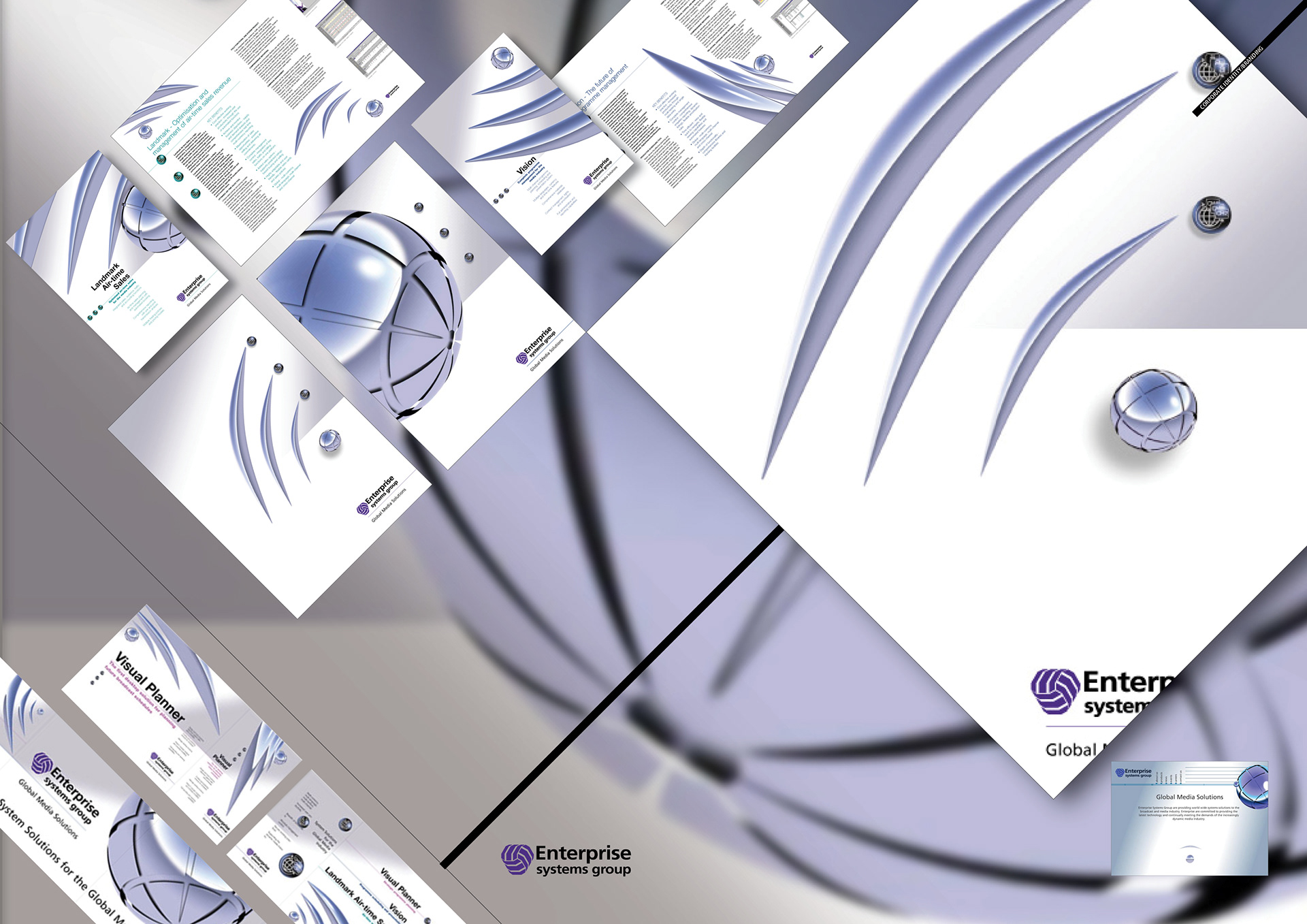
Having an identity that had evolved without creative graphic influence, Enterprise wanted to keep their existing logo whilst developing an identity that would bring their two flagship software solutions, that had evolved disparate and rogue graphic identities, back inside the company fold.
The look was based upon an image symbolising global broadcasting in general.
Exhibition graphics
Corporate brochure
Product brochures
Corporate folder
Website
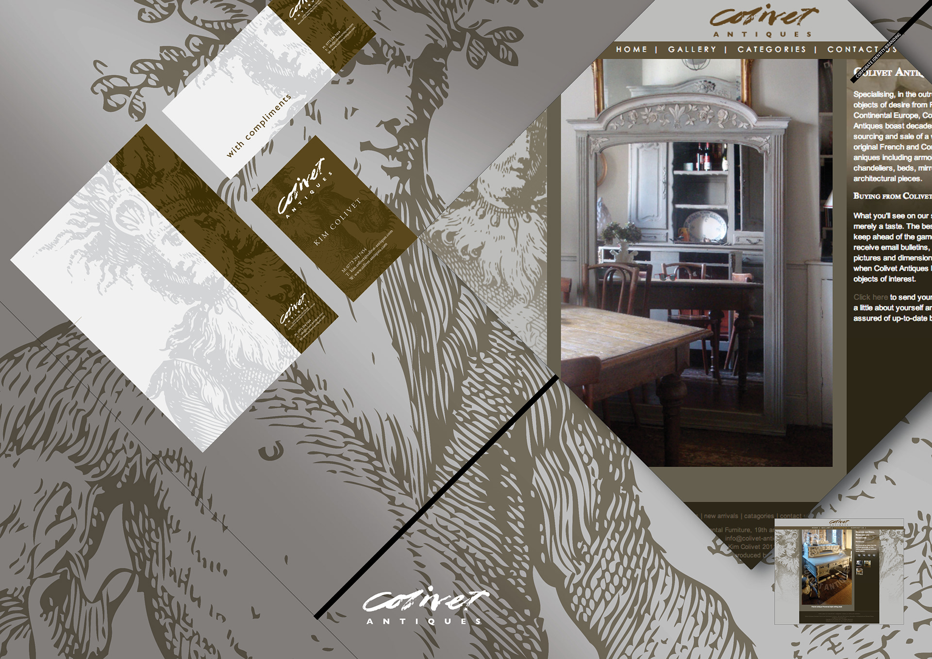
This company dealing in painted French antiques sells solely through antique fairs to other traders.
It needed to widen its customer base beyond trade to retail customers.
To achieve this it needed to increase perceived value and get new customers to the antique fairs.
This corporate identity and website showcases its work, thus inspiring and enticing with possibilities shown with in-situ photography.
Logo
Stationery
Website
Photography.
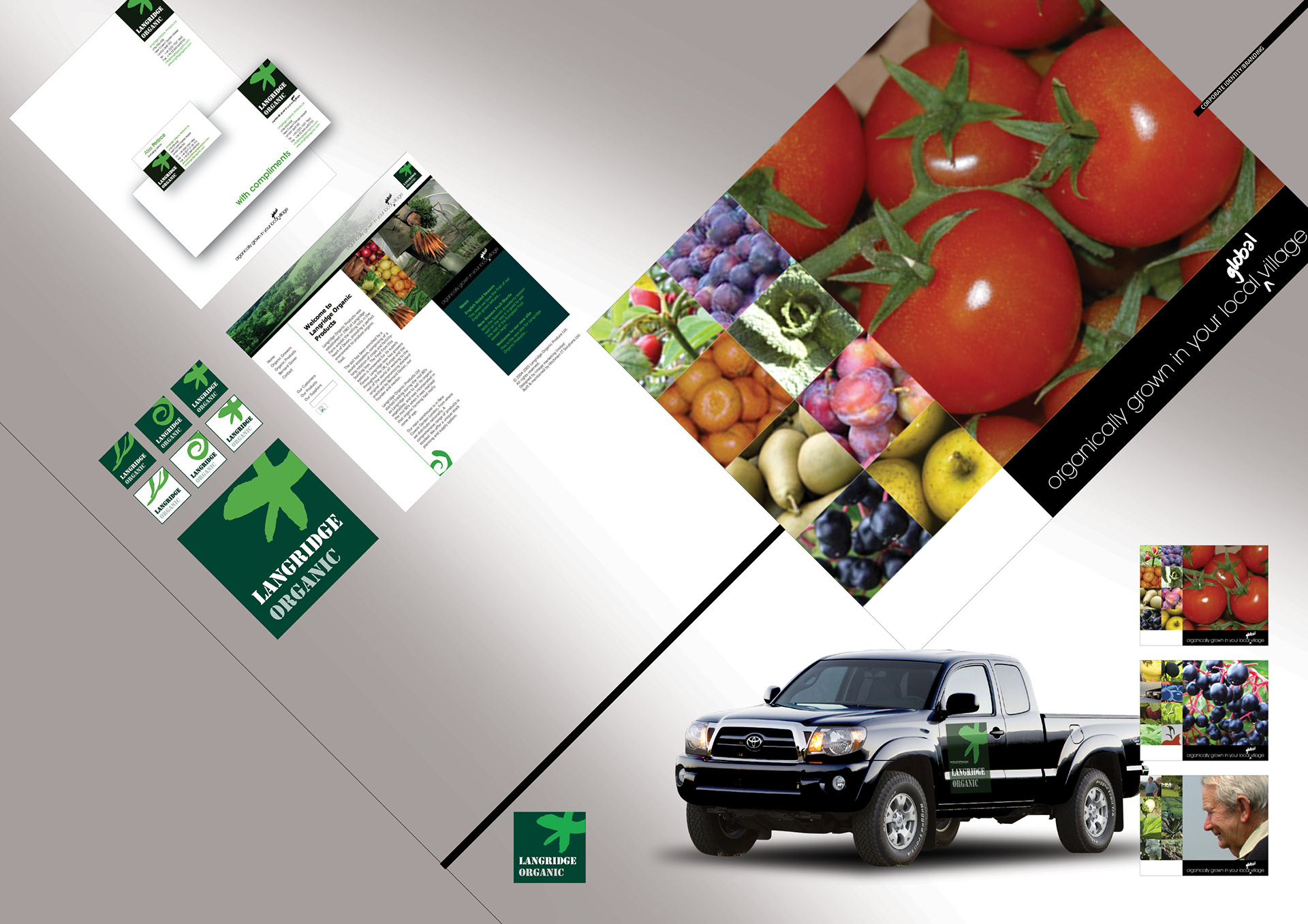
Langridge Organic, a
Covent Garden based organic produce suppliers.
Covent Garden based organic produce suppliers.
Logo and sub brands
Vehicle livery
Website
Stationary
The logo and sub brands needed to reflect the global origin of the organic produce they marketed and distributed without compromising their own produce from their Devon farm.
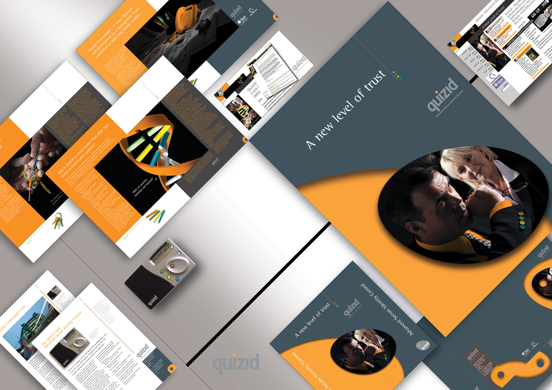
Corporate identity designed from the ground up comprising;
Corporate brochure
Datasheets
Exhibition and display graphics
Folders
Stationery
Email marketing
Website
At launch, overcoming new-product fatigue in the security services sector, in just six days over 107,000 visitors hit the Quizid website.
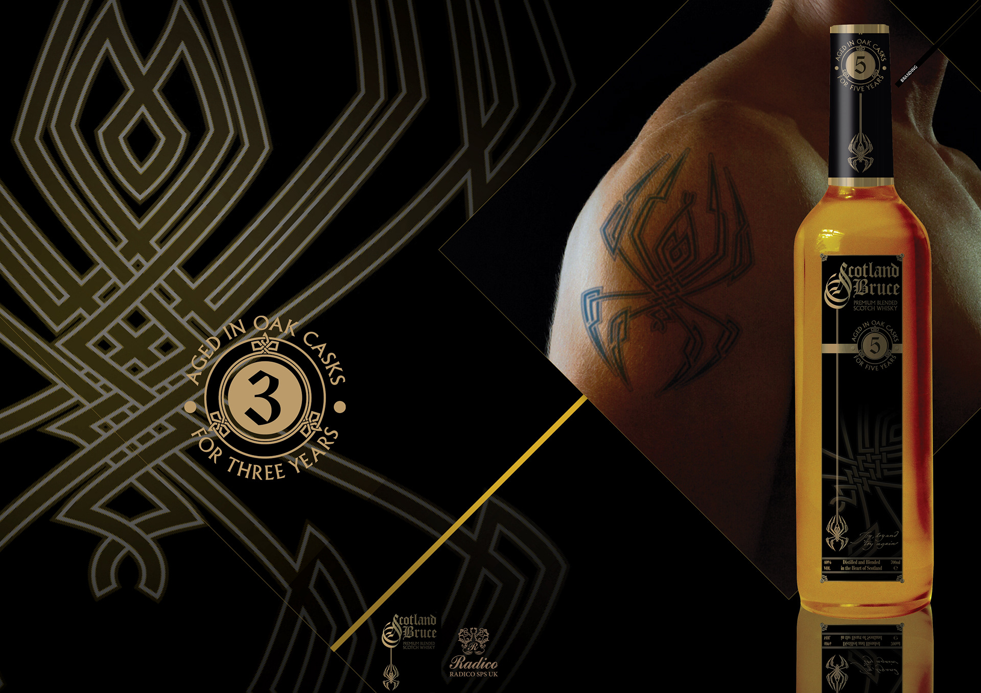
Scotland Bruce was the name chosen for a blended Scotch Whiskey bought by Indian distillers Radico Khaitan for distribution outside the UK.
Without losing it’s core values of tradition and taste, it needed a brand identity that was very Scottish, rugged and masculine, yet targeting a younger market than whiskies normally attract.
Multiple logos
Copywriting
Exhibition graphics
Labling
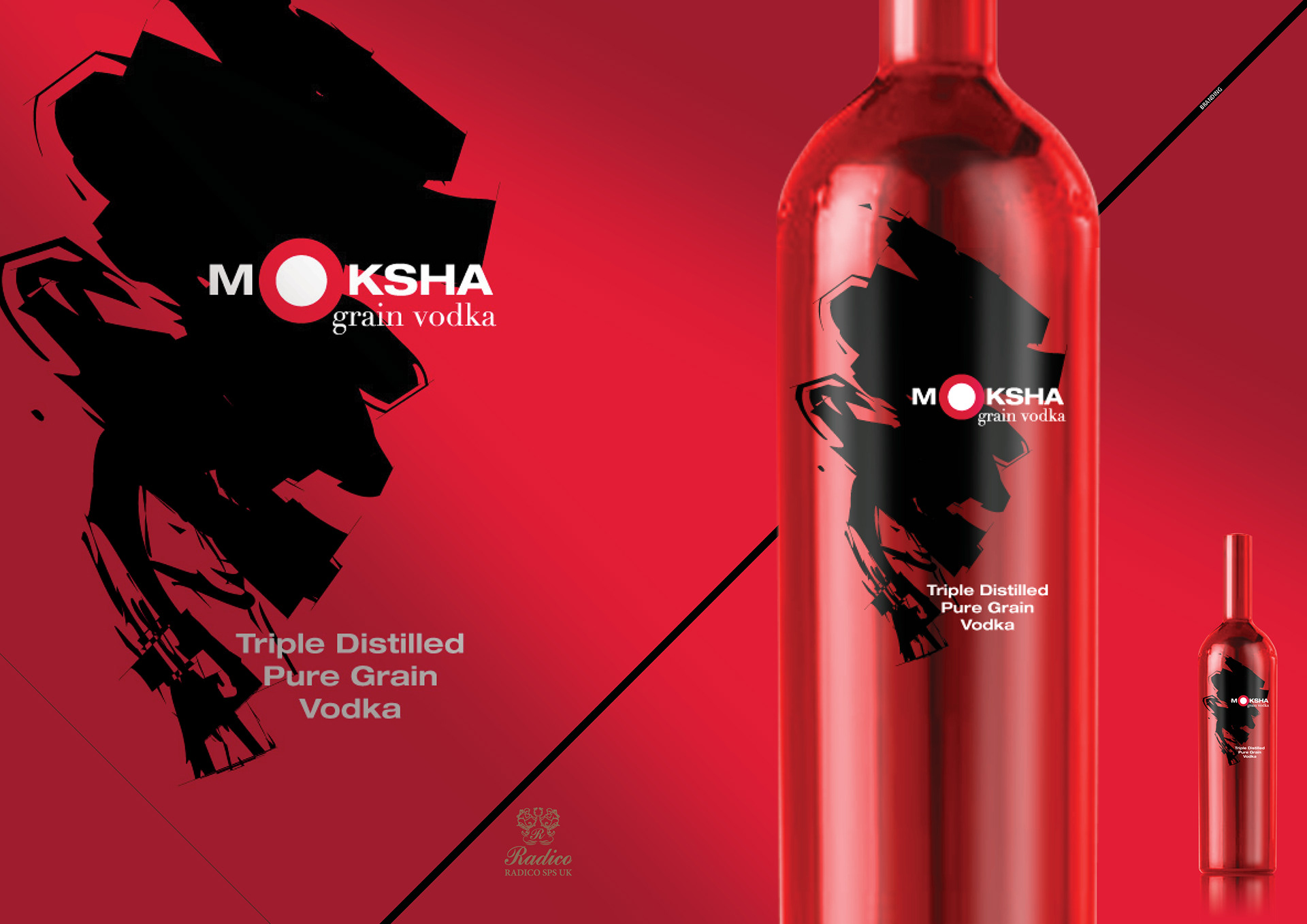
Moksha, a Sanskrit word signifiying the freedom of Nirvana, was the name chosen for an Indian triple distilled pure gran vodka by Indian distillers Radico Khaitan for distribution outside the UK, specifically emerging global markets.
With its red metallic bottle sleeve and logo comprising an enigmatic white out of red circle on black gestural brushwork, Moksha remains mindful of, yet unabashed by Vodka’s perceived Eastern European heritage.
Design
Concepts
Touch-up and image manipulation
Logos
Labling
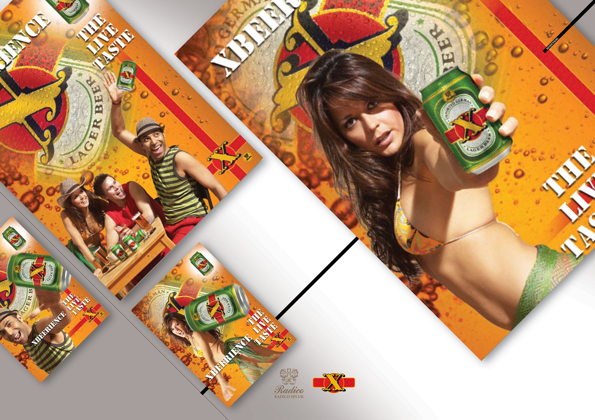
Adverts for Indian distillers Radico Khaitan, for X Beer which they wished to market outside the UK to emerging global markets.
Featuring Danielle Lineker, it’s daring and aggressive and targeted at adventure-seeking 25-34 year-olds.
Concepts
Headlining
Design
Art direction
Retouch
Artwork
Adverts
Display
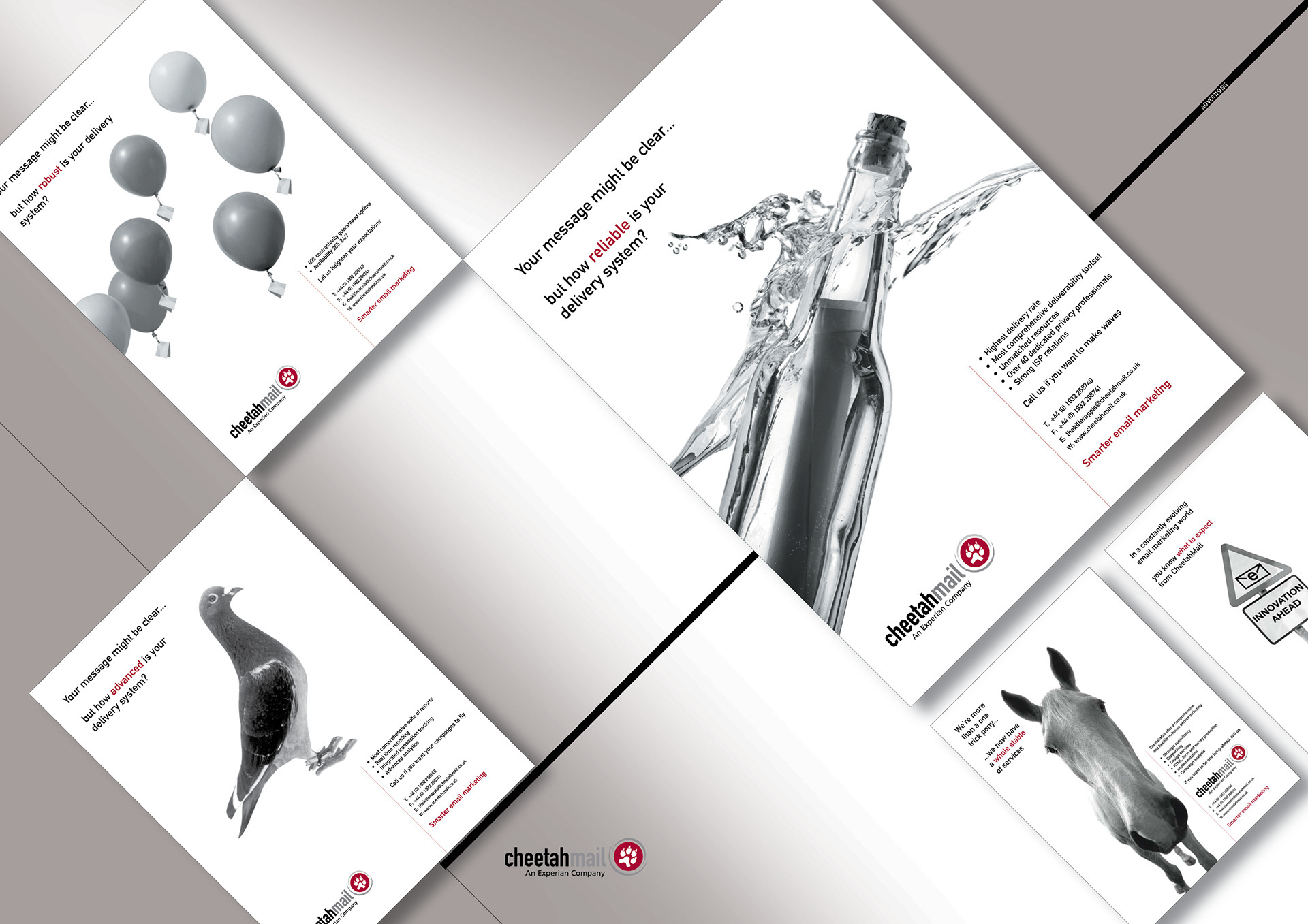
Placing robustness and dependability in the minds of customers and prospects of CheetahMail, the industry leader in email marketing.
The initial bird, bottle and balloon ads ran for a year and were subsequently joined by the horse and the road sign ads highlighting versatility and innovation.
Adverts
Display
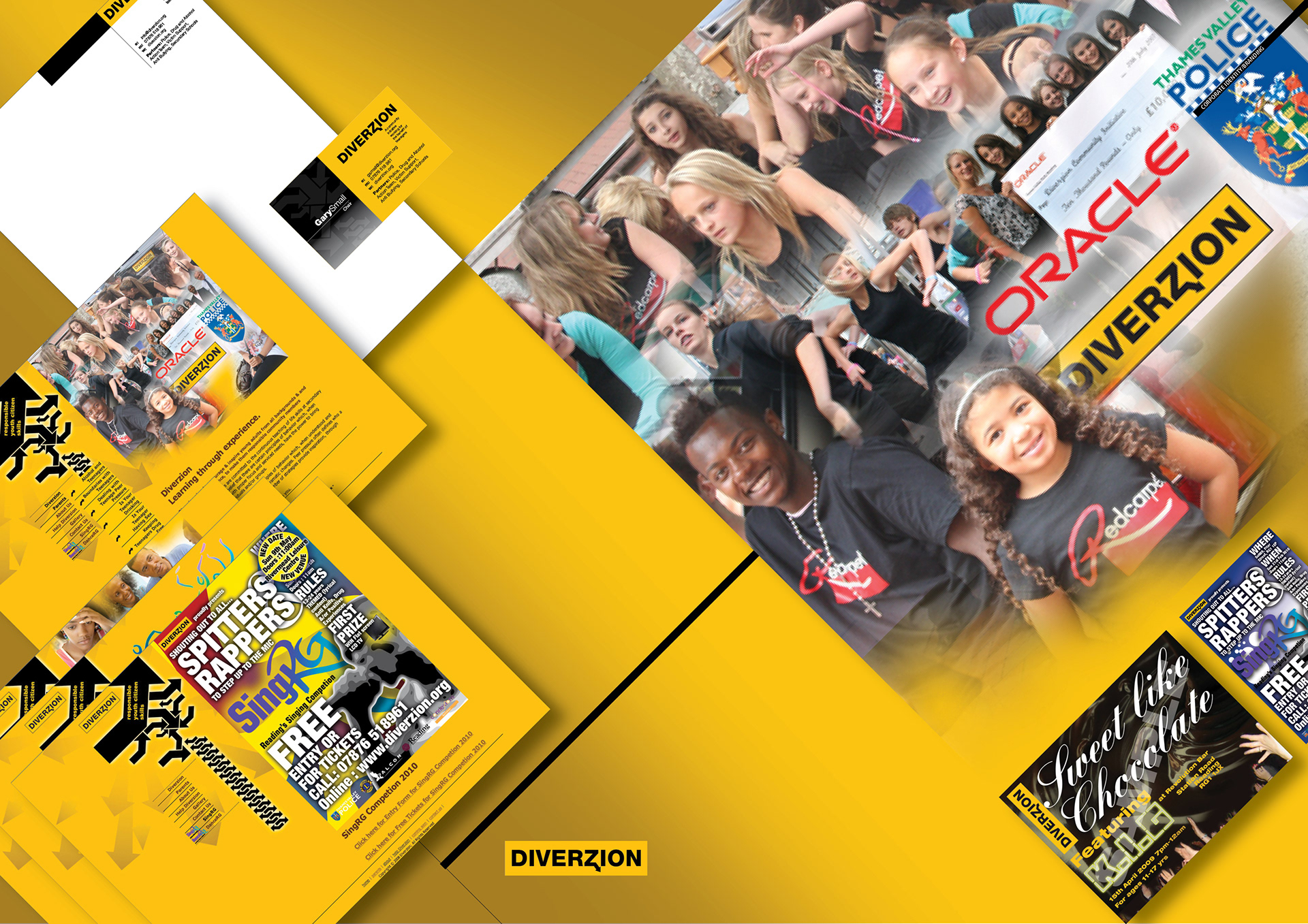
Pro-bono work for Diverzion. Originating in Afro-Caribbean West Reading, this initiative was launched to discuss and promote strategies to engender cross cultural inclusion in a programme to educate and discuss teenage boundaries, combat bullying and drug abuse/knife crime through self funding dance, music and other events
Logo and stationery
Website
Flyers and tickets
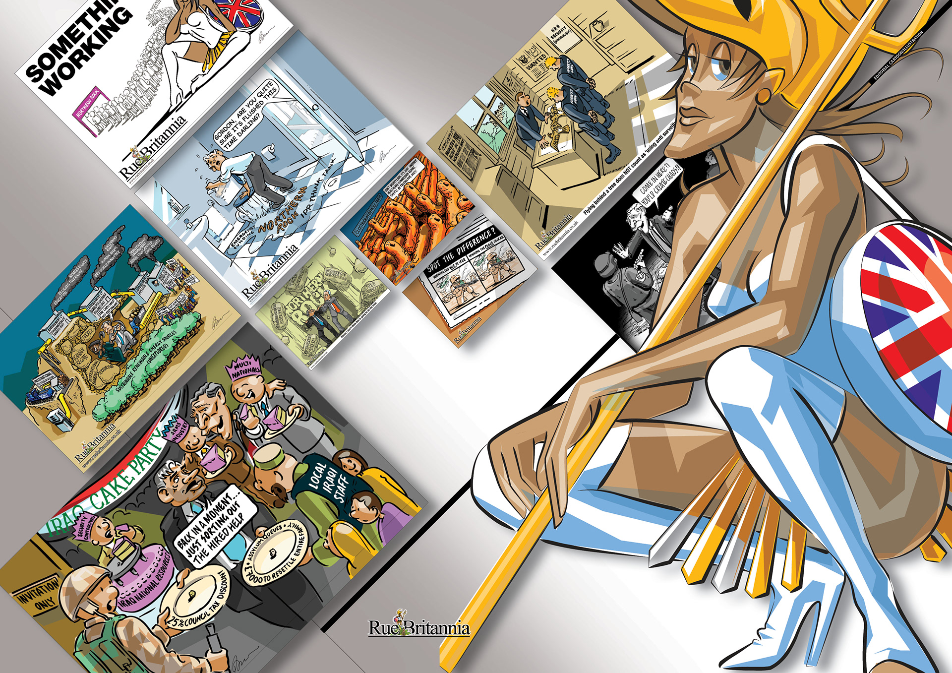
Rue Britannia
A personal daily editorial Cartoon blog that examined events affecting the UK from both home and abroad featuring RueB (pronounced Ruby).
An homage to Varoomshka, a satirical comic strip by John Kent that appeared in The Guardian in the 70’s, RueB is a new embodiment of today’s Briton... mixed race, sympathetic and reticent about her past.
Sadly I had to put her on ice when she became too demanding of my time.
HTML emails that, once designed, tested and approved, are generally uploaded to email marketing service providers. Ideally they play a important part in an integrated online and offline campaign.
Design and layout
HTML
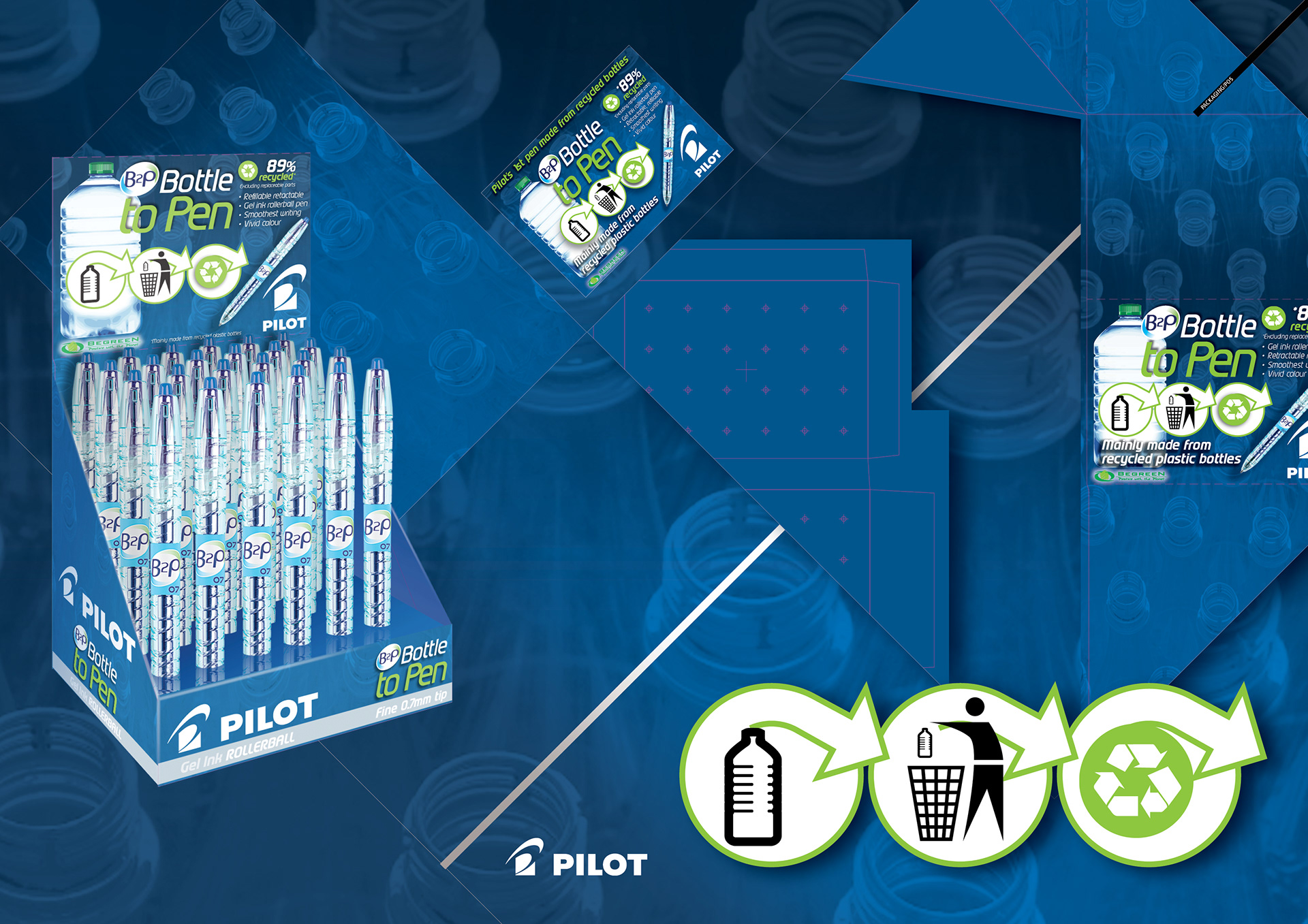
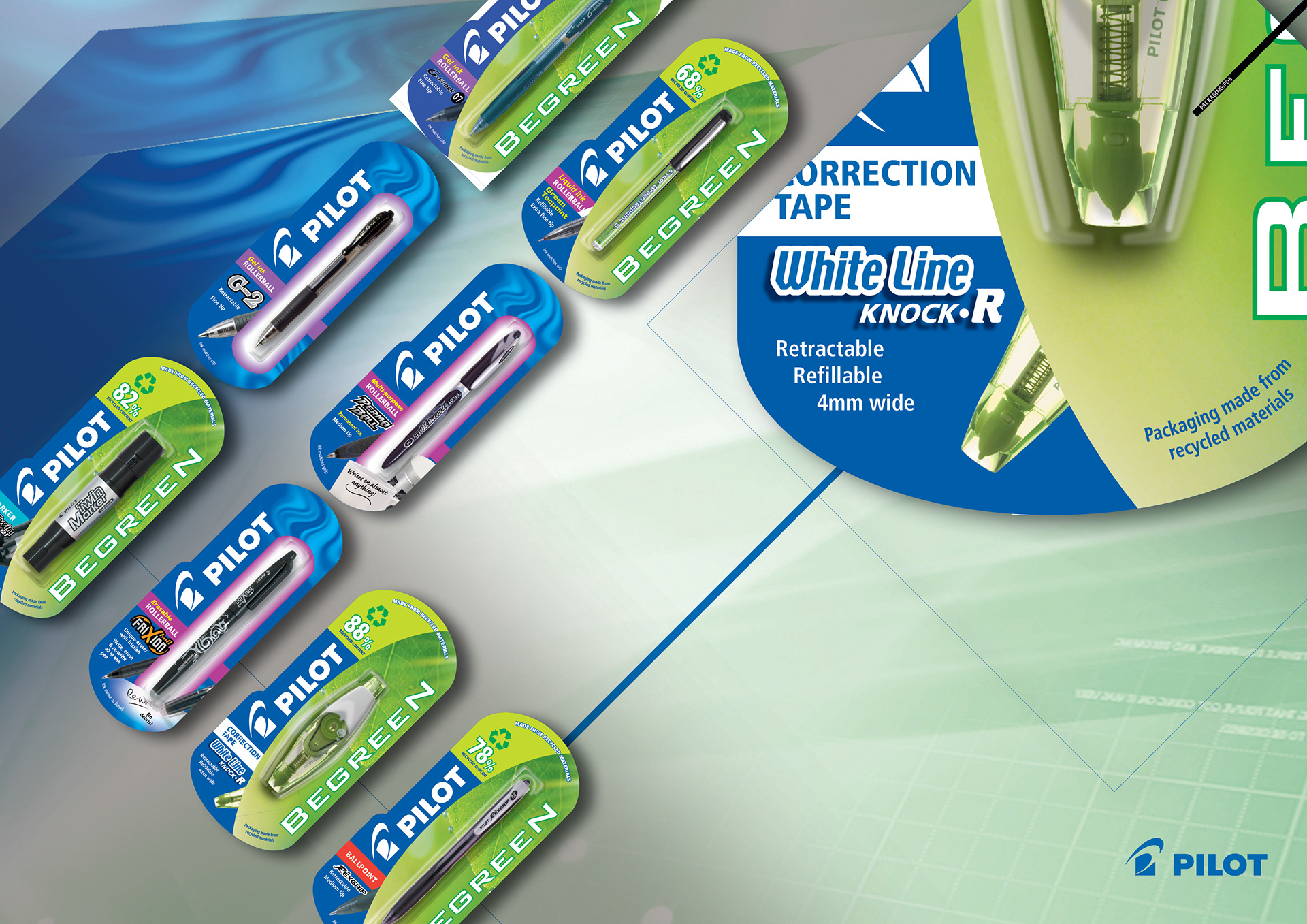
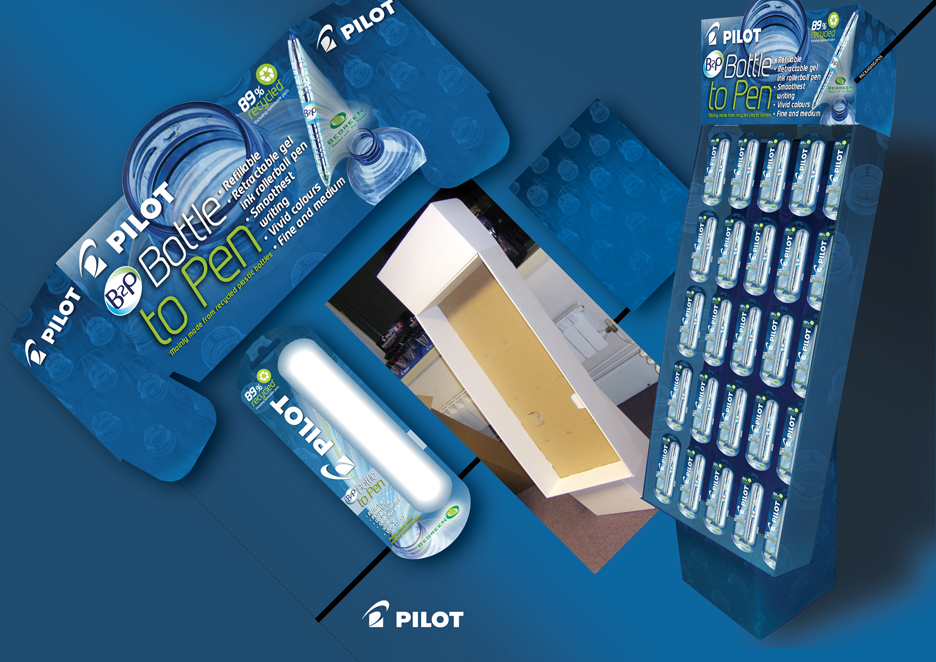
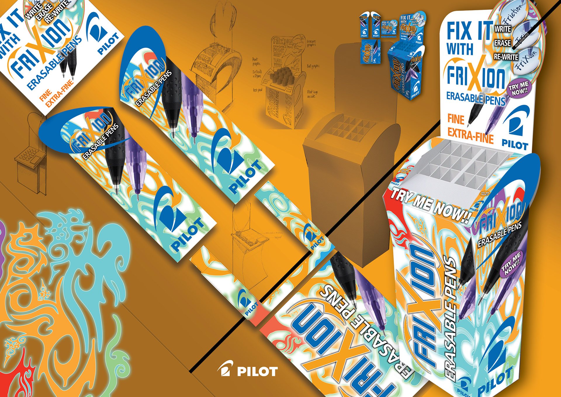
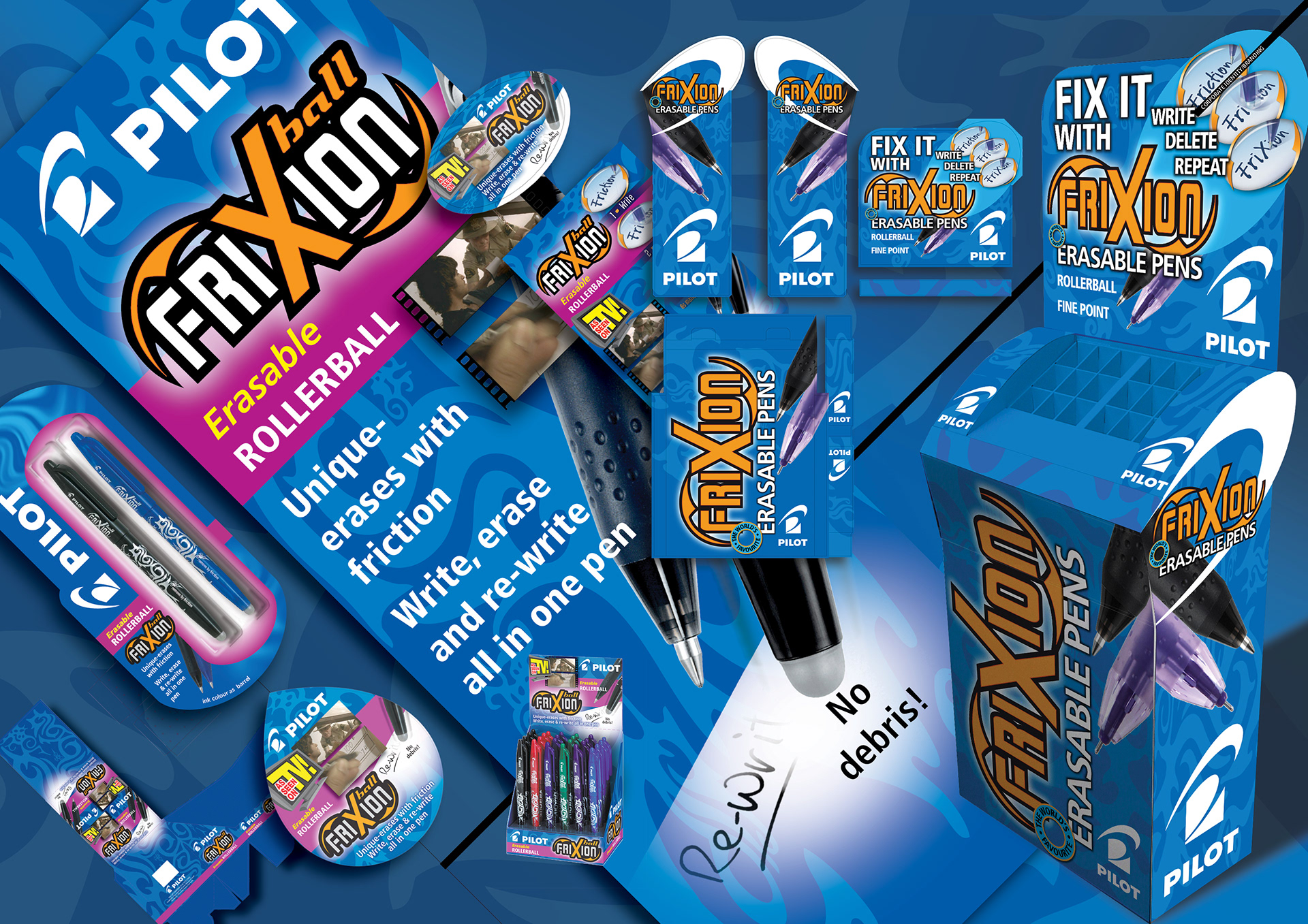
B2P (Bottle To Pen) 24 pen counter display unit (CDU) using the look and feel of the advert that I’d previously designed. The graphic device explaining the use of recycled plastic bottles to make the pen casing was the deciding feature..
Advert
POS
Packaging
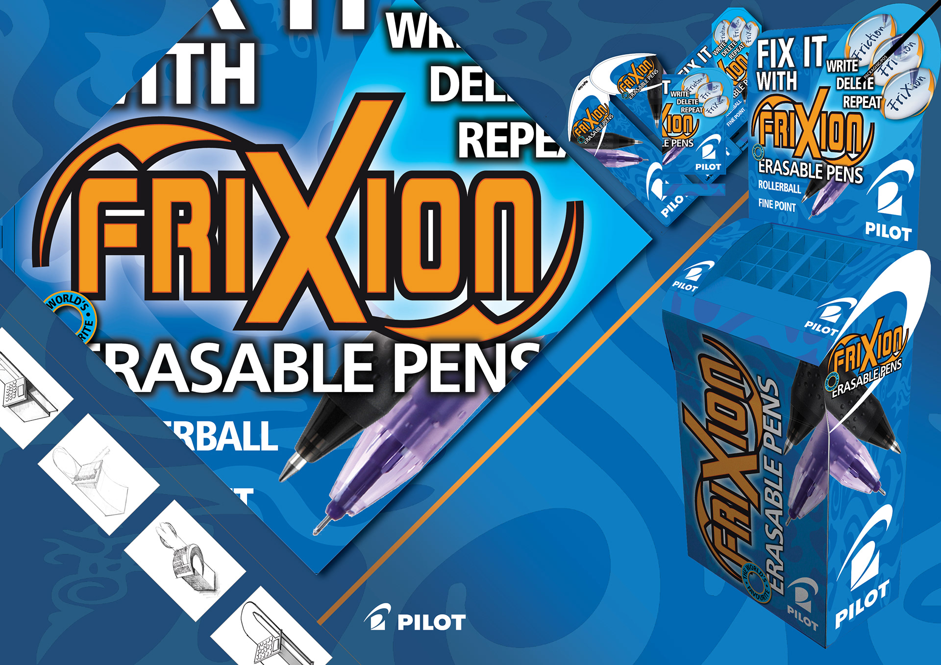
Free Standing Display Unit (FSDU) for Pilot Pen runaway success; erasable ball pen Frixion. The loose pen display was designed based on the scythe part of the Pilot Pen logo and the Frixion tattoo theme from the packaging of the blister packs.
Standardisation of design of range of best selling Pilot pens for Blister Card euro-slot packs.
A complex exercise involving brands sub-classified under multiple brands.
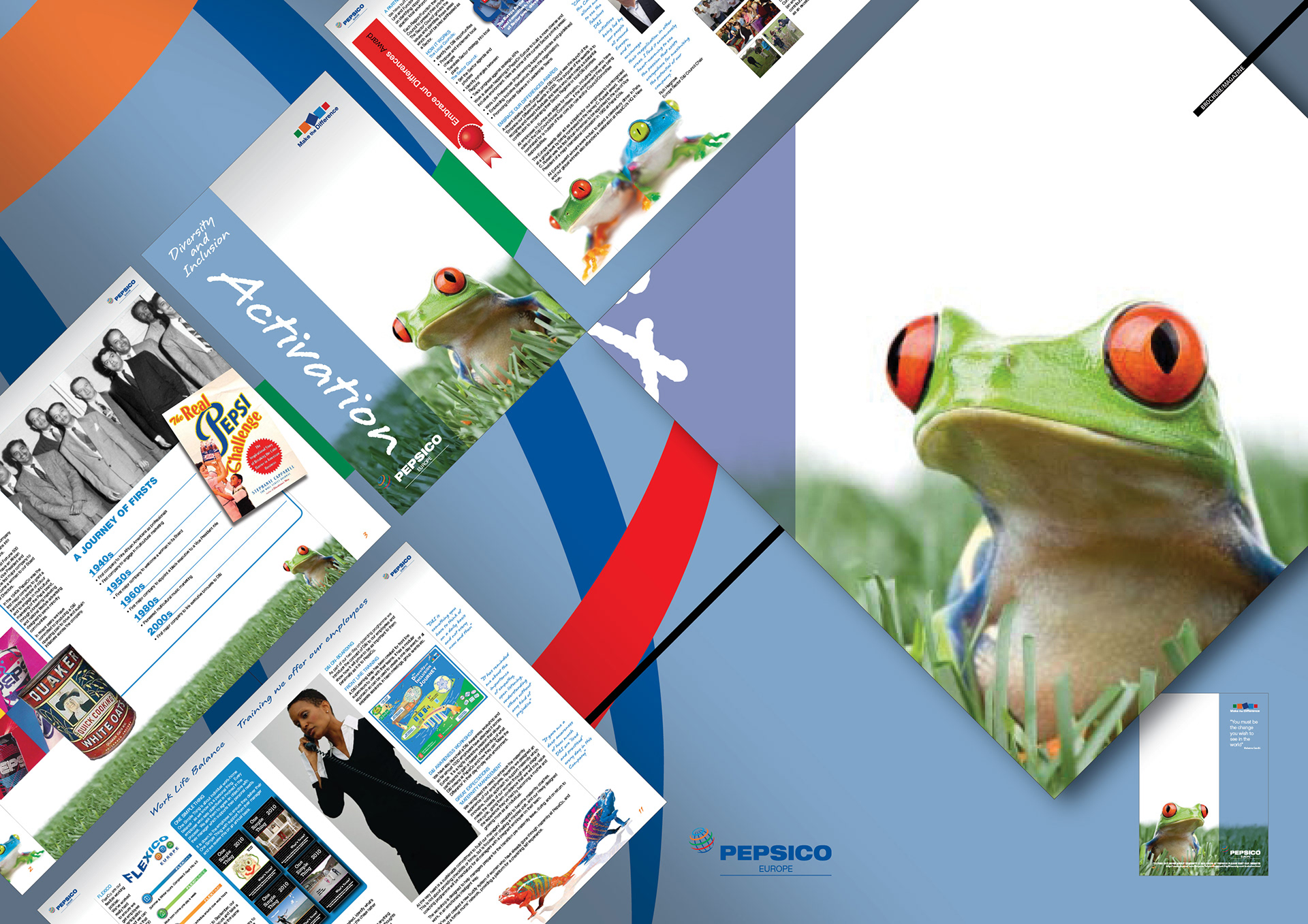
16pp Pepsico brochure promoting their current and historical commitment to a culture of diversity and inclusion in the workplace and the value that it brings to the Pepsico brandx as a whole.
Design
Layout
Copywriting and editing
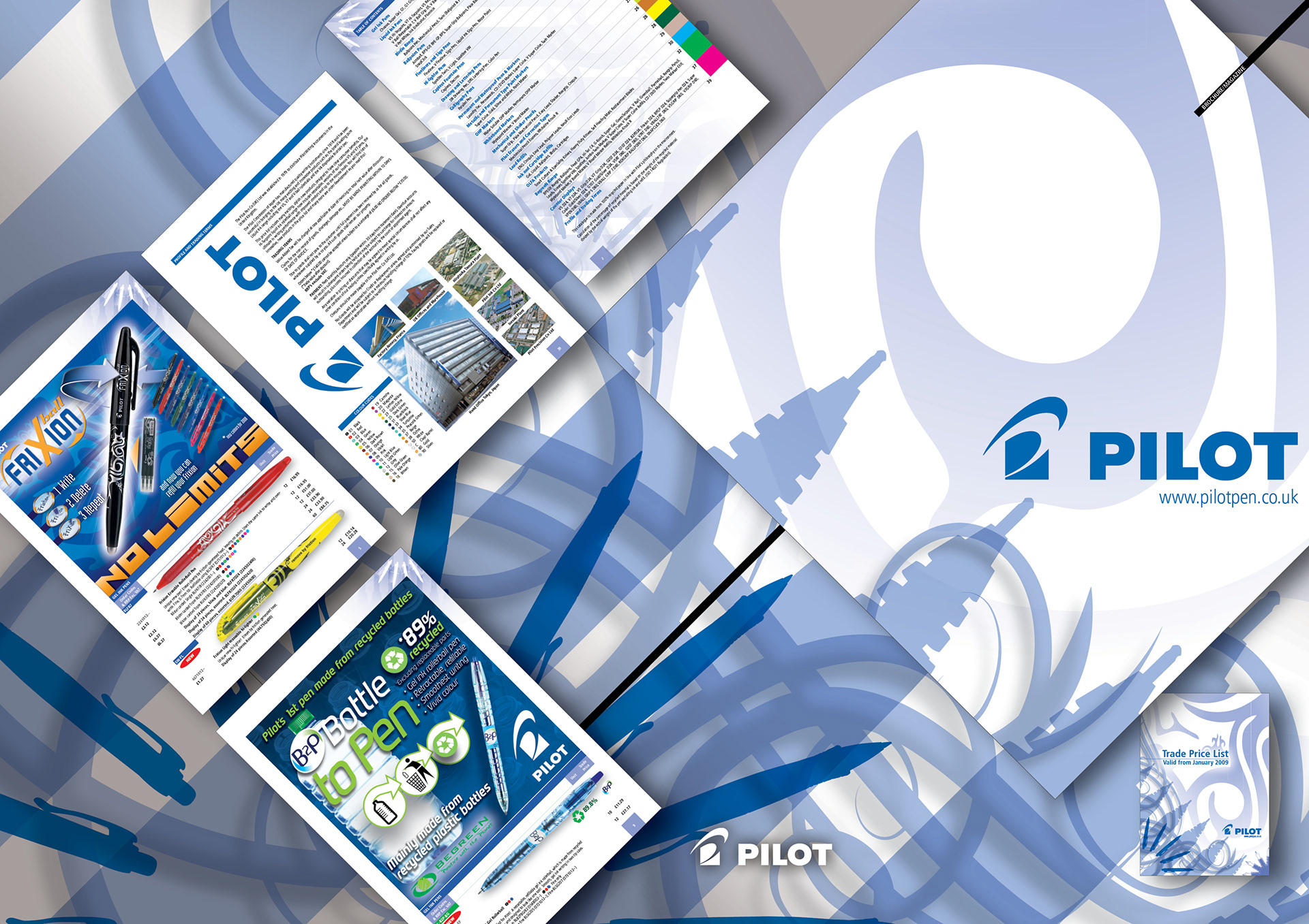
40pp Pilot brochure showing the complete Pilot Pen UK offering including Olfa craft tools
Design and layout
Illustration and image manipulation
Colour coding
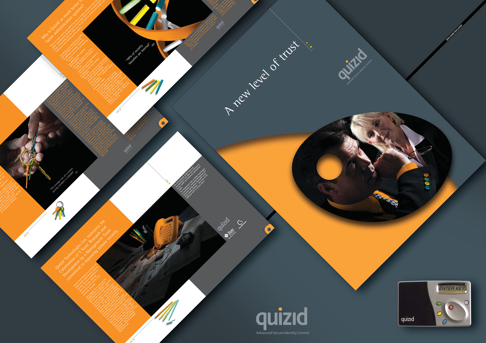
12pp corporate brochure theming on the 4 colours crucial to the operation of the quizid card itself.
The brochure drove the corporate identity employed throughout all other collaterol.
Design and layout
Illustration and image manipulation
Colour coding
Self promotion
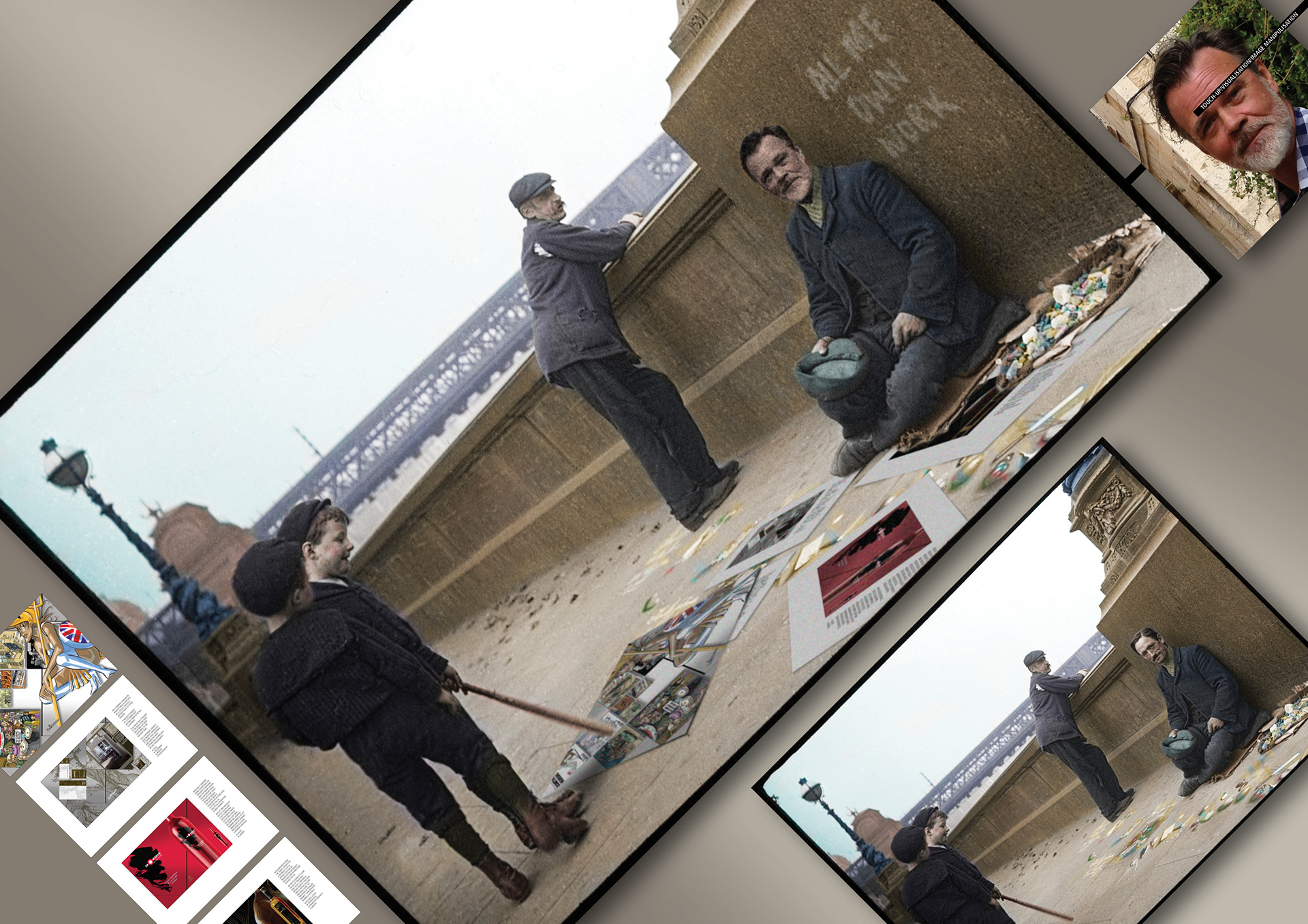
Original The Pavement Artist by F. de Paula Cembrano 1890.
Original The Pavement Artist by F. de Paula Cembrano 1890.
Masks
Colour manipulation
Noise
Cloning
Texture matching
Guassian blur
Perspective
Colour manipulation
Noise
Cloning
Texture matching
Guassian blur
Perspective
Self promotion
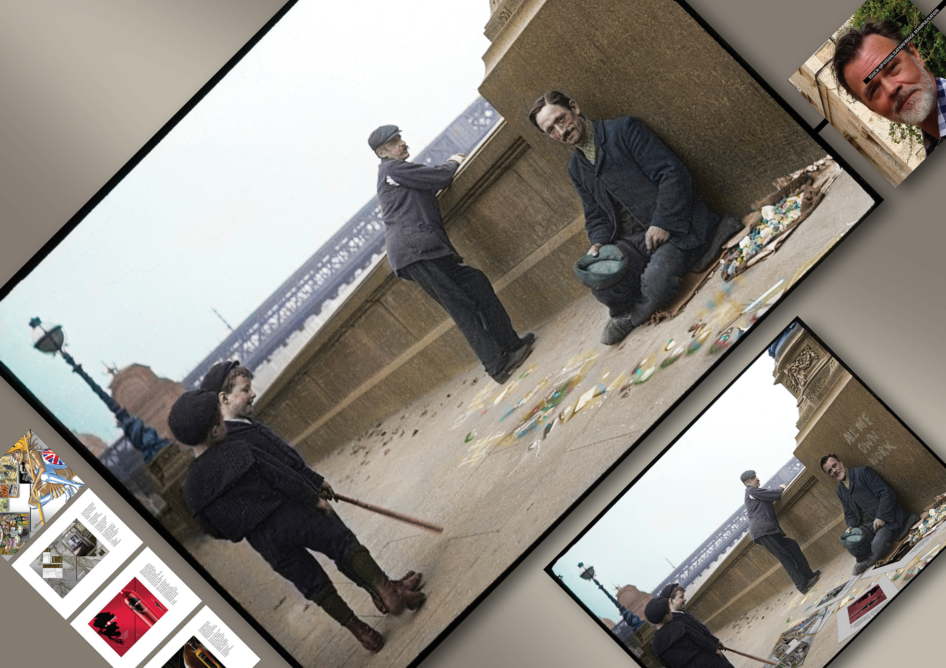
Original The Pavement Artist by F. de Paula Cembrano 1890.
Original The Pavement Artist by F. de Paula Cembrano 1890.
Masks
Colour manipulation
Noise
Cloning
Texture matching
Guassian blur
Perspective
Colour manipulation
Noise
Cloning
Texture matching
Guassian blur
Perspective
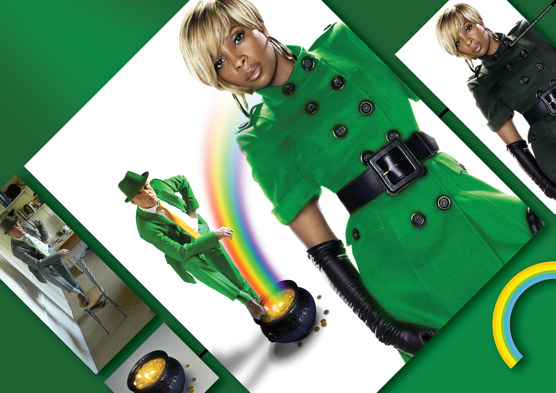
Self promotion
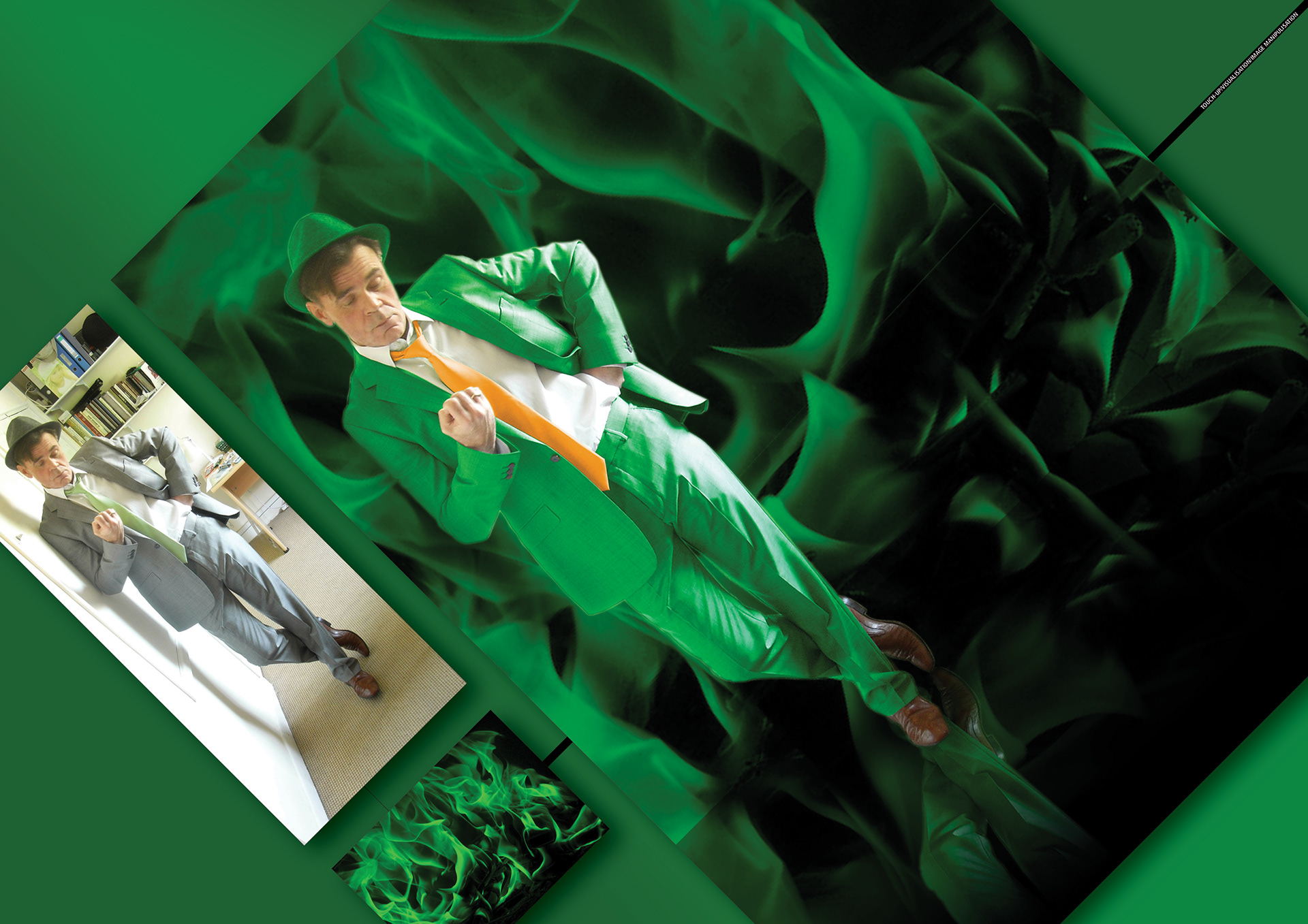
St Patrick’s Day.
Masks
Paths
Colour manipulation
Noise
Cloning
texture matching
Guassian blur
Perspective
Self promotion
St Patrick’s Day.
Masks
Paths
Colour manipulation
Noise
Cloning
texture matching
Guassian blur
Perspective
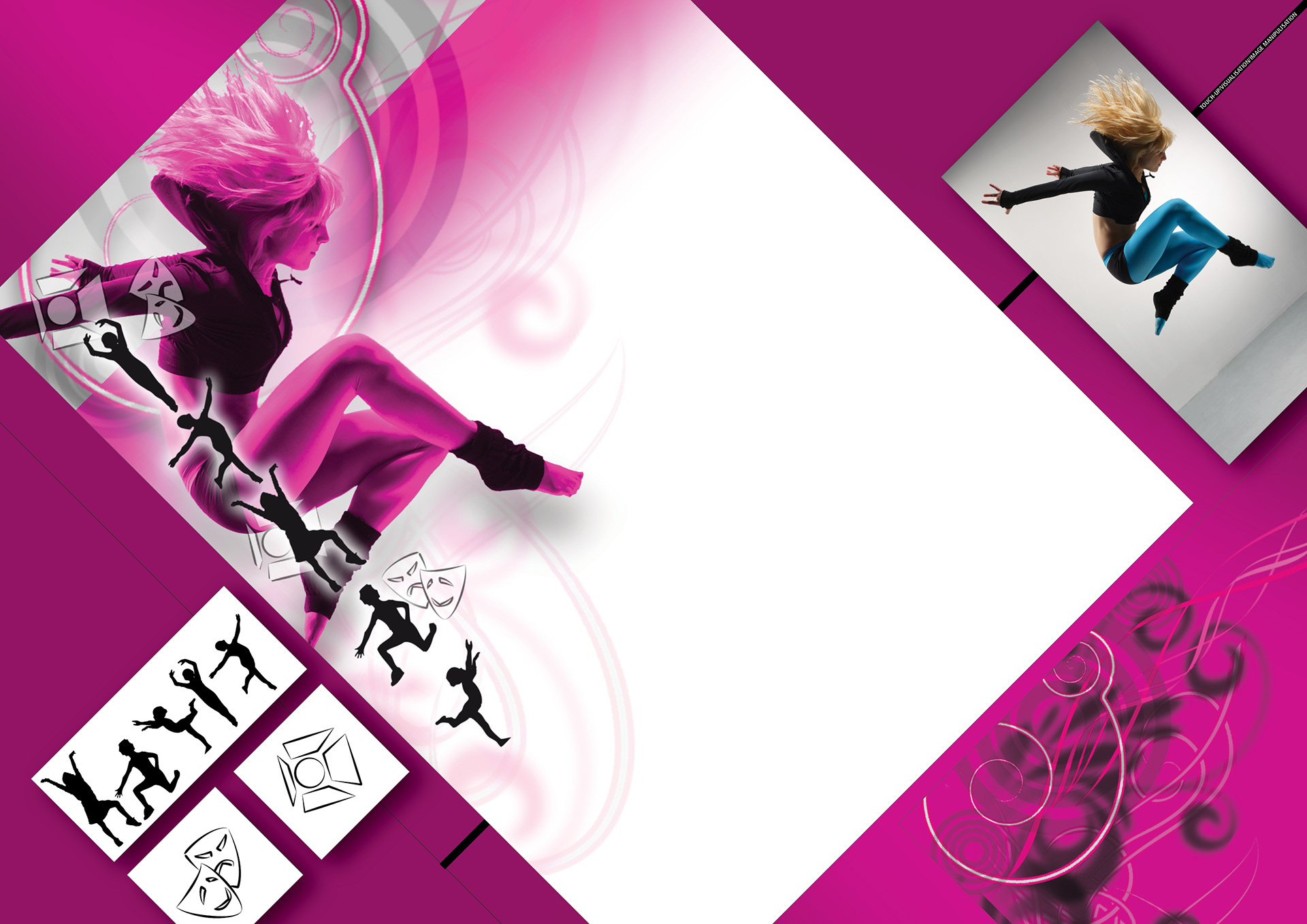
Dance Studio
Backdrop for general use.
Web
Display
Masks
Paths
Colour manipulation
Noise
Cloning
texture matching
Guassian blur
Perspective
The client’s cardboard engineer put together a prototype based on my drawings.
I then took my design layouts and comped together a visual, using supplied photography. AFTER CLIENT approval, I progressed to finished artwork.
Masks
Paths
Colour manipulation
Noise
Cloning
texture matching
Guassian blur
Perspective
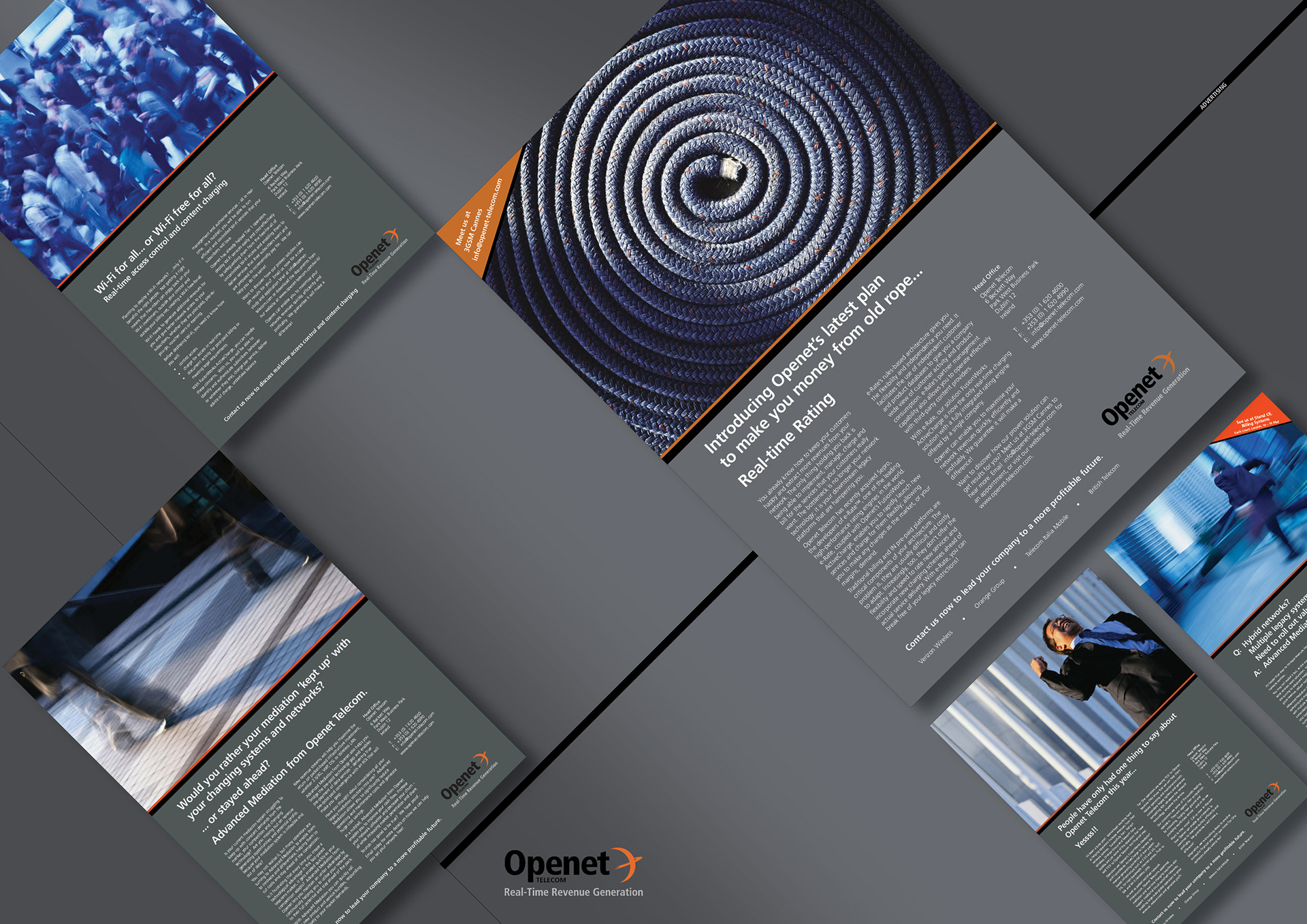
This series of adverts showcased their new corporate identity and were themed on posing risks and providing premptive solutions.
The aim was twofold: to keep their target market aware of opportunities, risks and billing solutions in the ever evolving telecoms industry and to promote and maintain their position as the ‘go-to company’ in their field.
Branding
Headlines
Concepts
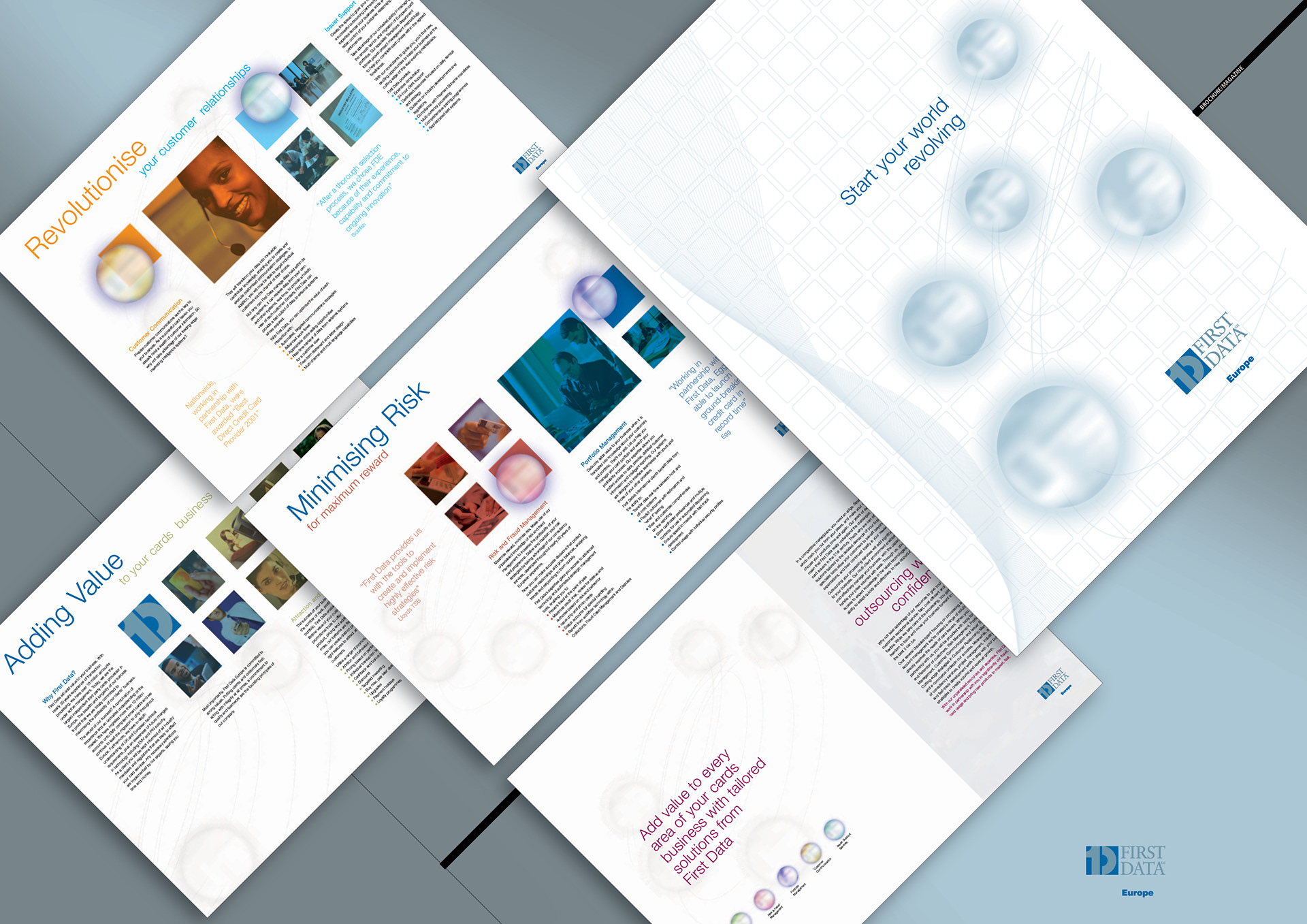
First Data Europe’s 12pp brochure for their 3rd Party Card Processing solution.
The challenge here was to build a distinct look and feel for this and subsequent product literature within an established corporate identity.
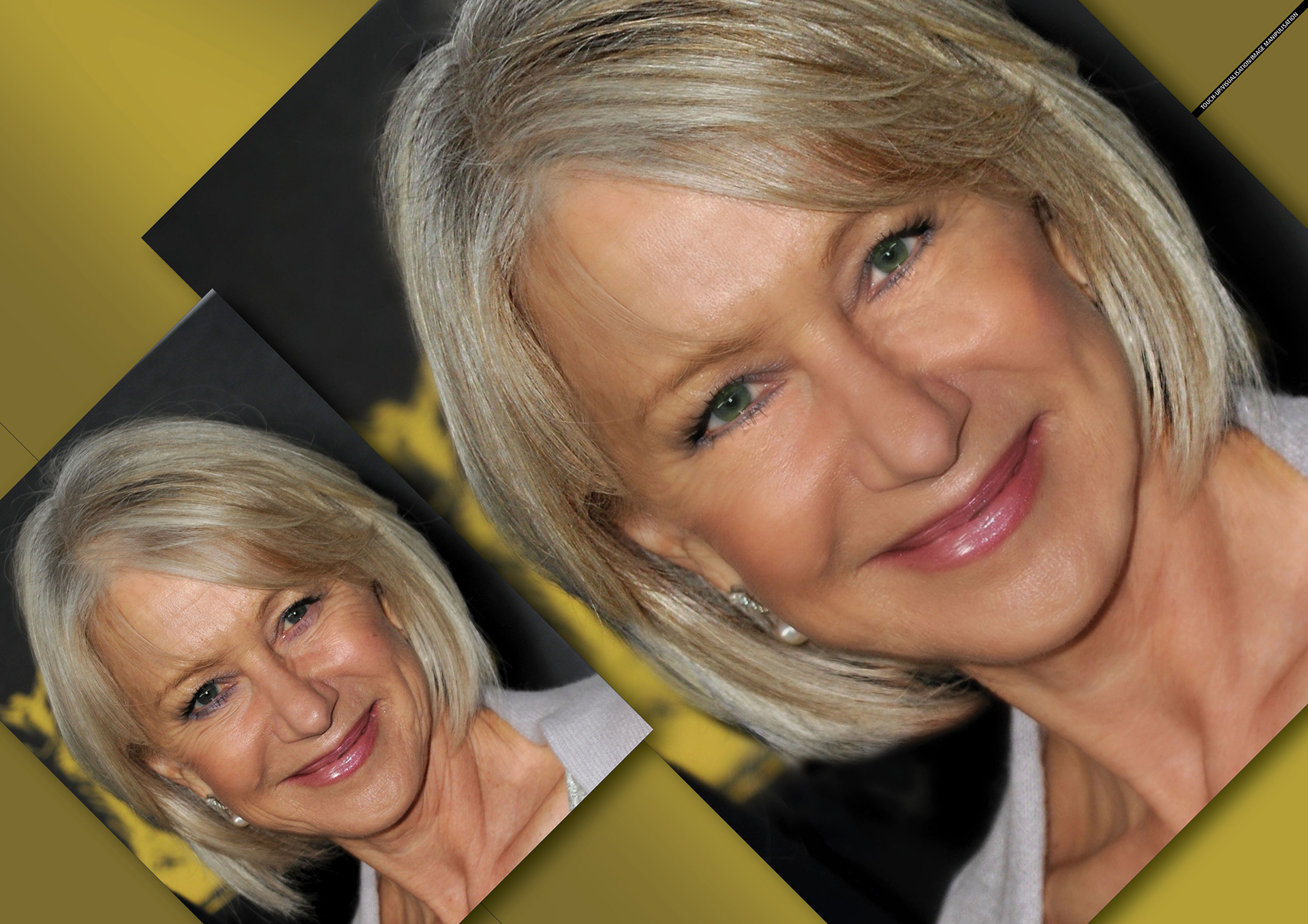
Self promotion
Helen Mirren
Masks
Paths
Colour manipulation
Noise
Cloning
Texture matching
Guassian blur
Cardboard engineers put together a prototype based on my drawings.
I then took my design layouts and comped together a visual, using supplied photography. AFTER CLIENT approval, I progressed to finished artwork.
Design
Visuals
Illustration
Image manipulation
Layout
Artwork
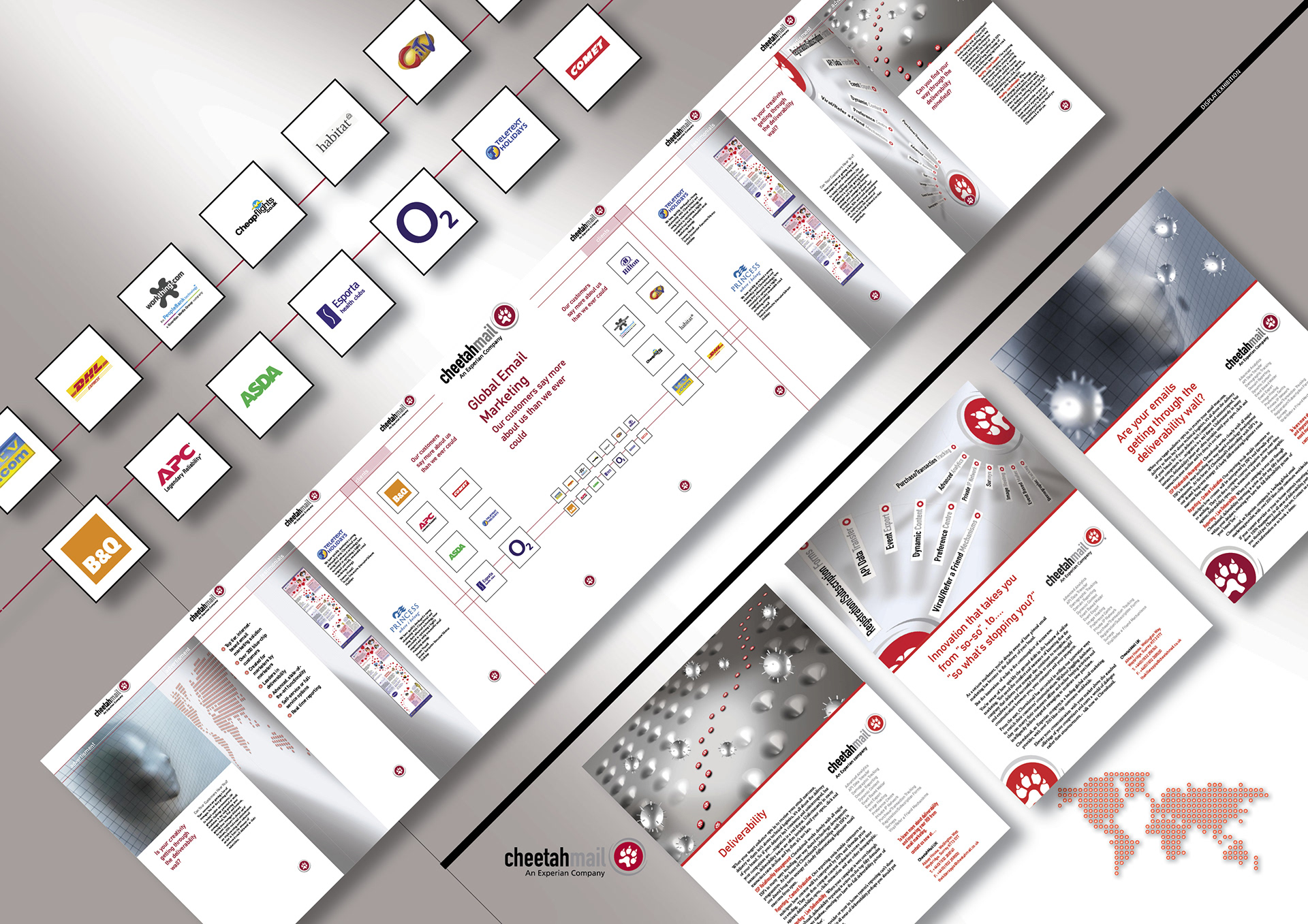
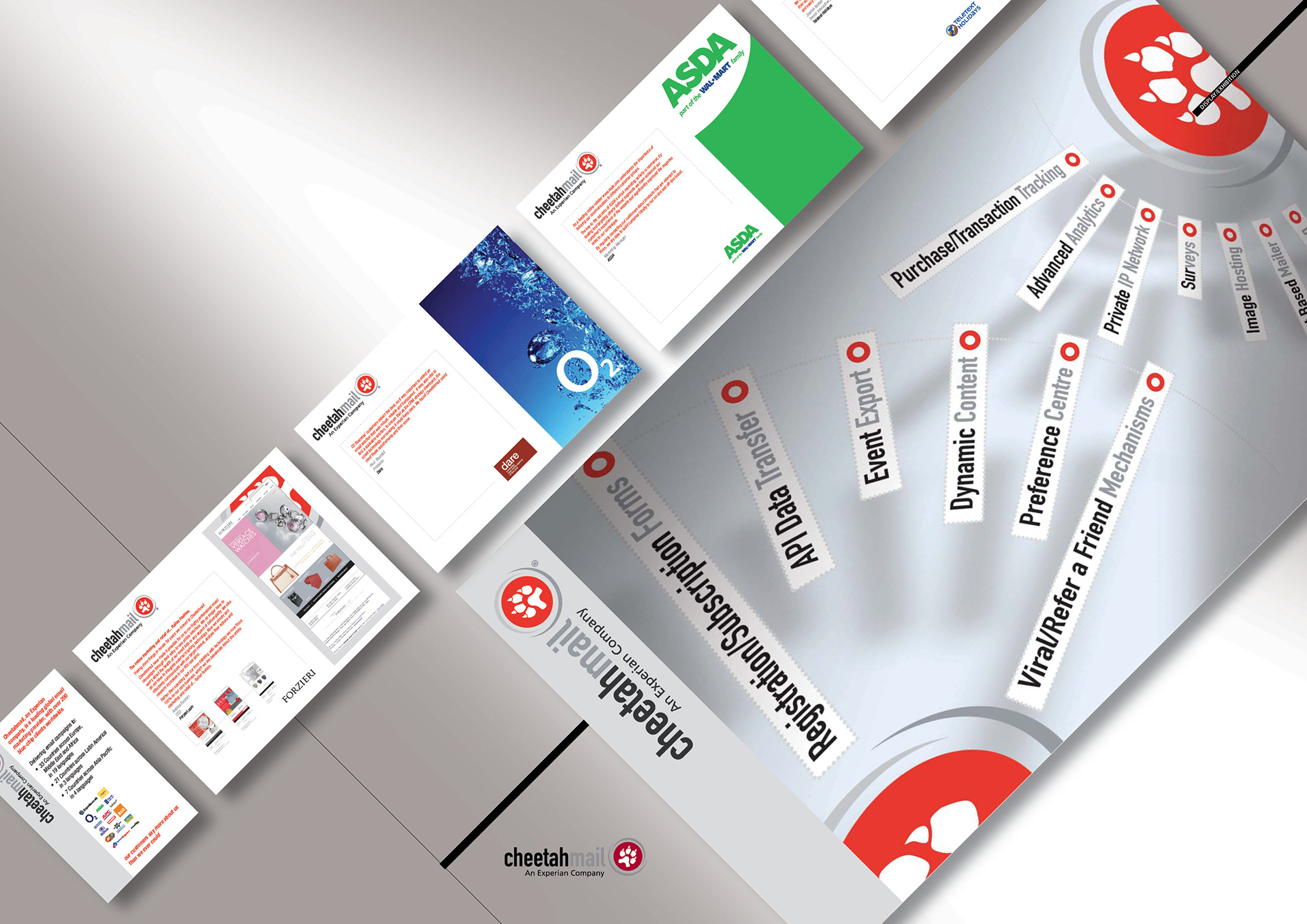
9 display panels showcaseing blue-chip clients and including graphics I’d developed for an earlier series of ads.
Design
Visuals
Illustration
Image manipulation
Layout
Artwork
Stand design and panels.
Design
Visuals
Illustration
Image manipulation
Layout
Artwork
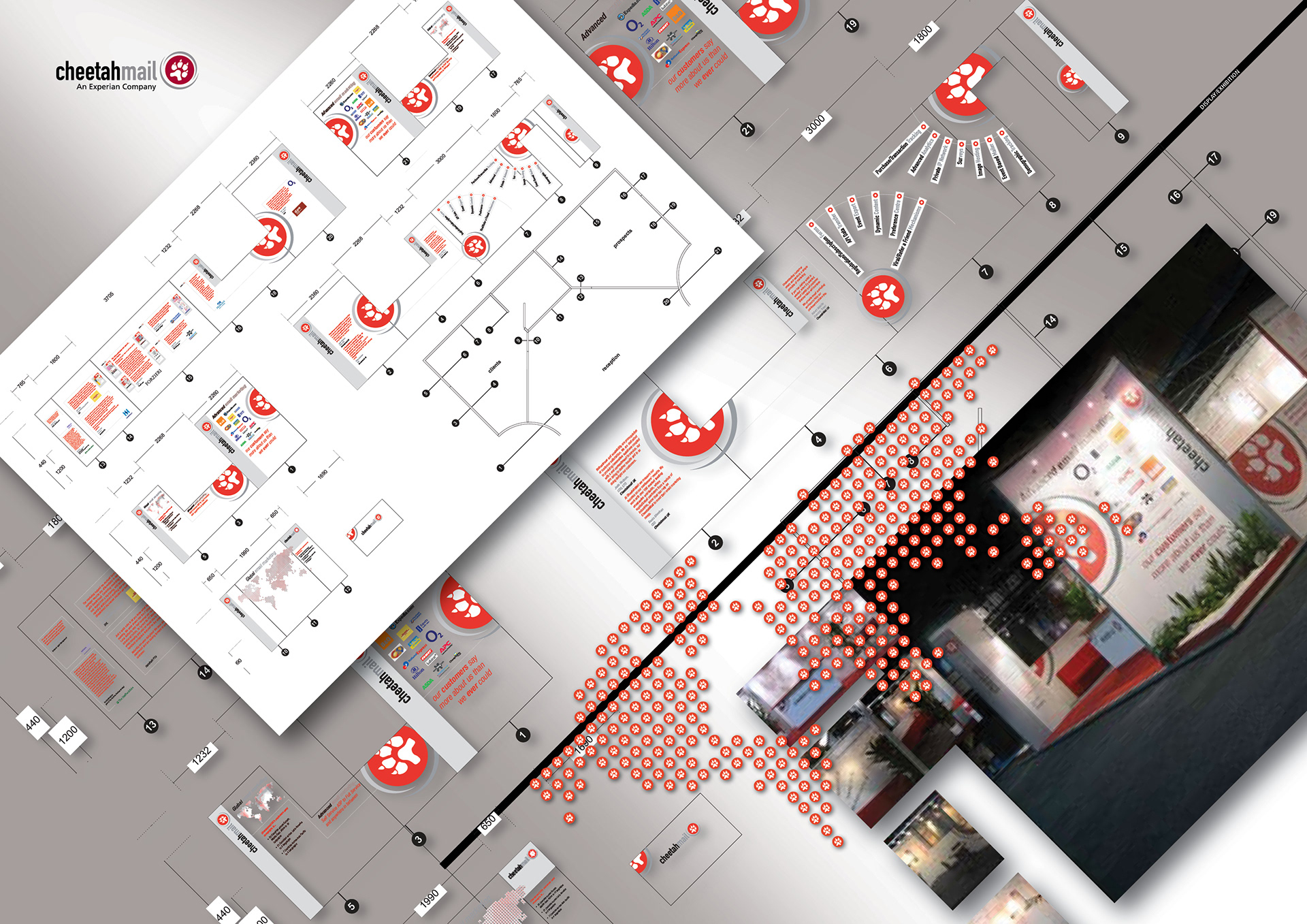
Stand design and panels for Olympia Event.
Design
Visuals
Illustration
Image manipulation
Layout
Artwork
Branding
blister card
shelf wobbler
counter display unit
free standing display unit
pop-up banner
poster

Adverts for Indian distillers Radico Khaitan, for X Beer which they wished to market outside the UK to emerging global markets.
Featuring Danielle Lineker, it’s daring and aggressive and targeted at adventure-seeking 25-34 year-olds.
Concepts
Headlining
Design
Art direction
Retouch
Artwork
Adverts
Display