
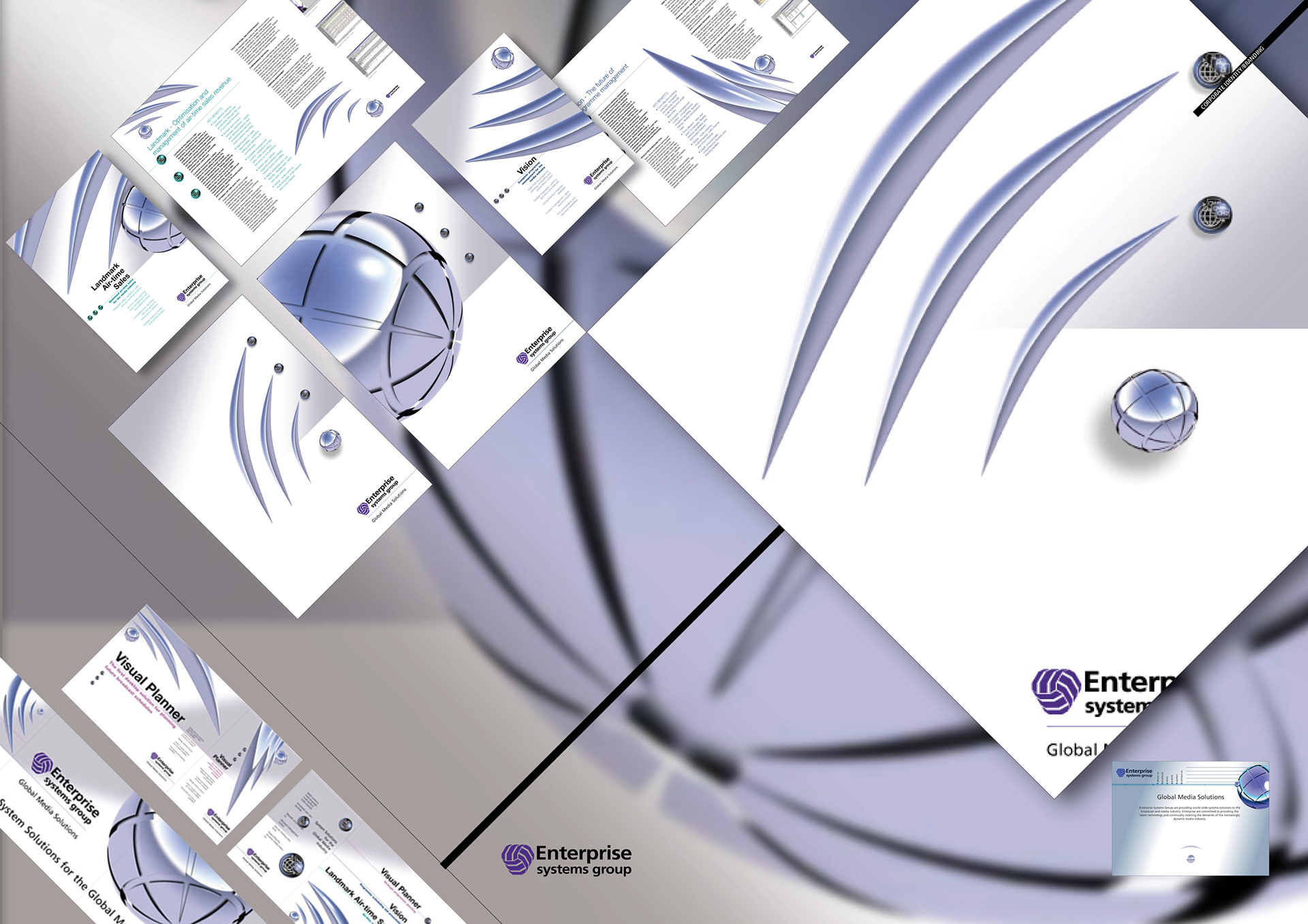
Having an identity that had evolved without creative graphic influence, Enterprise wanted to keep their existing logo whilst developing an identity that would bring their two flagship software solutions, that had evolved disparate and rogue graphic identities, back inside the company fold.
The look was based upon an image symbolising global broadcasting in general.
Exhibition graphics
Corporate brochure
Product brochures
Corporate folder
Website
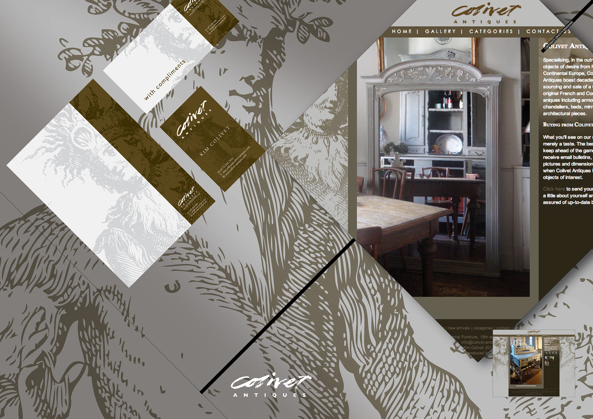
This company dealing in painted French antiques sells solely through antique fairs to other traders.
It needed to widen its customer base beyond trade to retail customers.
To achieve this it needed to increase perceived value and get new customers to the antique fairs.
This corporate identity and website showcases its work, thus inspiring and enticing with possibilities shown with in-situ photography.
Logo
Stationery
Website
Photography.
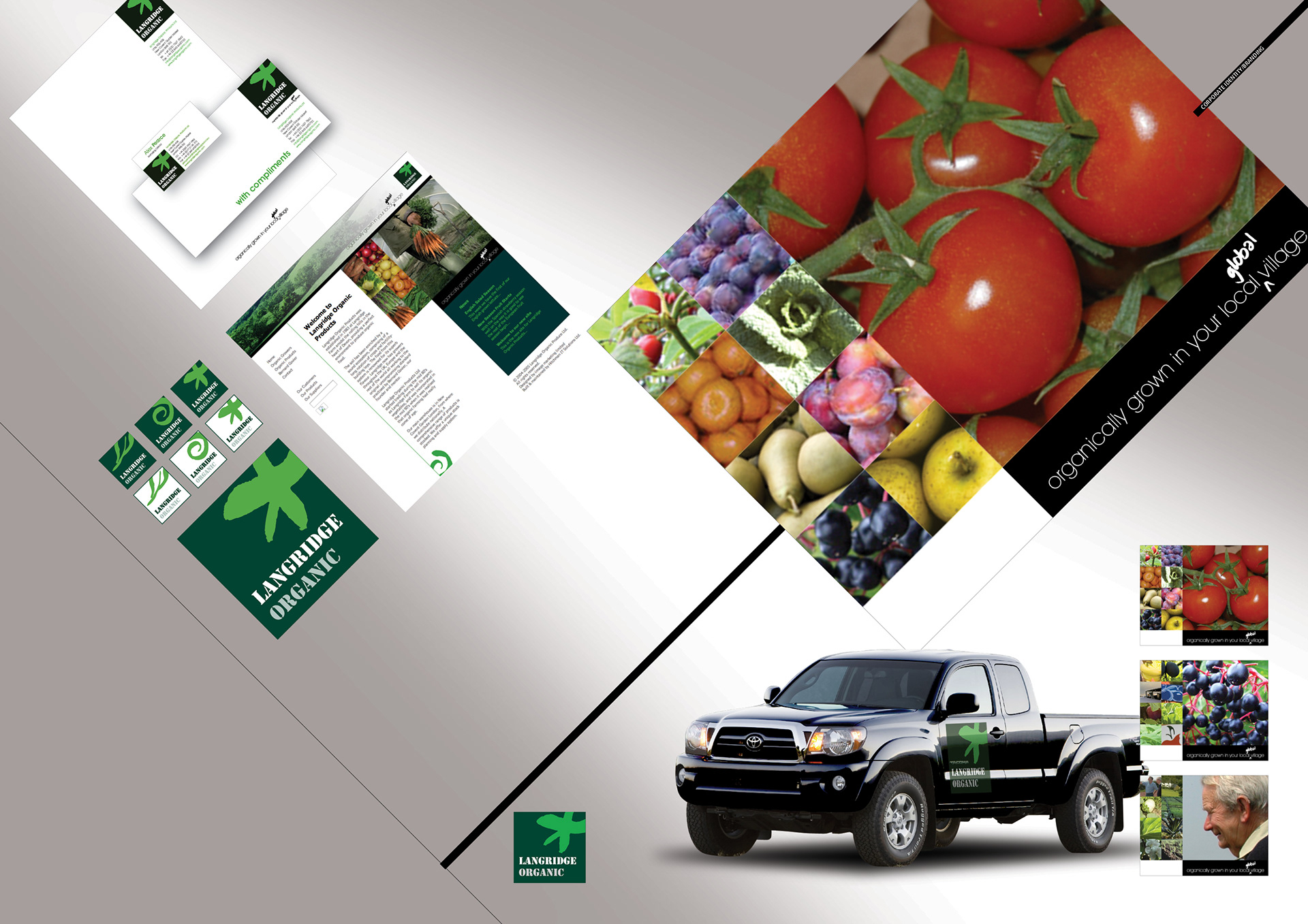
Langridge Organic, a
Covent Garden based organic produce suppliers.
Covent Garden based organic produce suppliers.
Logo and sub brands
Vehicle livery
Website
Stationary
The logo and sub brands needed to reflect the global origin of the organic produce they marketed and distributed without compromising their own produce from their Devon farm.
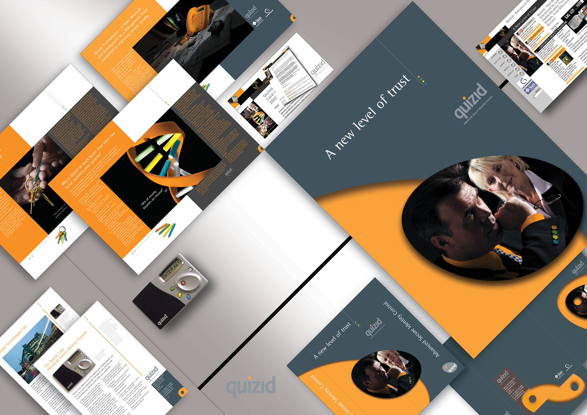
Corporate identity designed from the ground up comprising;
Corporate brochure
Datasheets
Exhibition and display graphics
Folders
Stationery
Email marketing
Website
At launch, overcoming new-product fatigue in the security services sector, in just six days over 107,000 visitors hit the Quizid website.
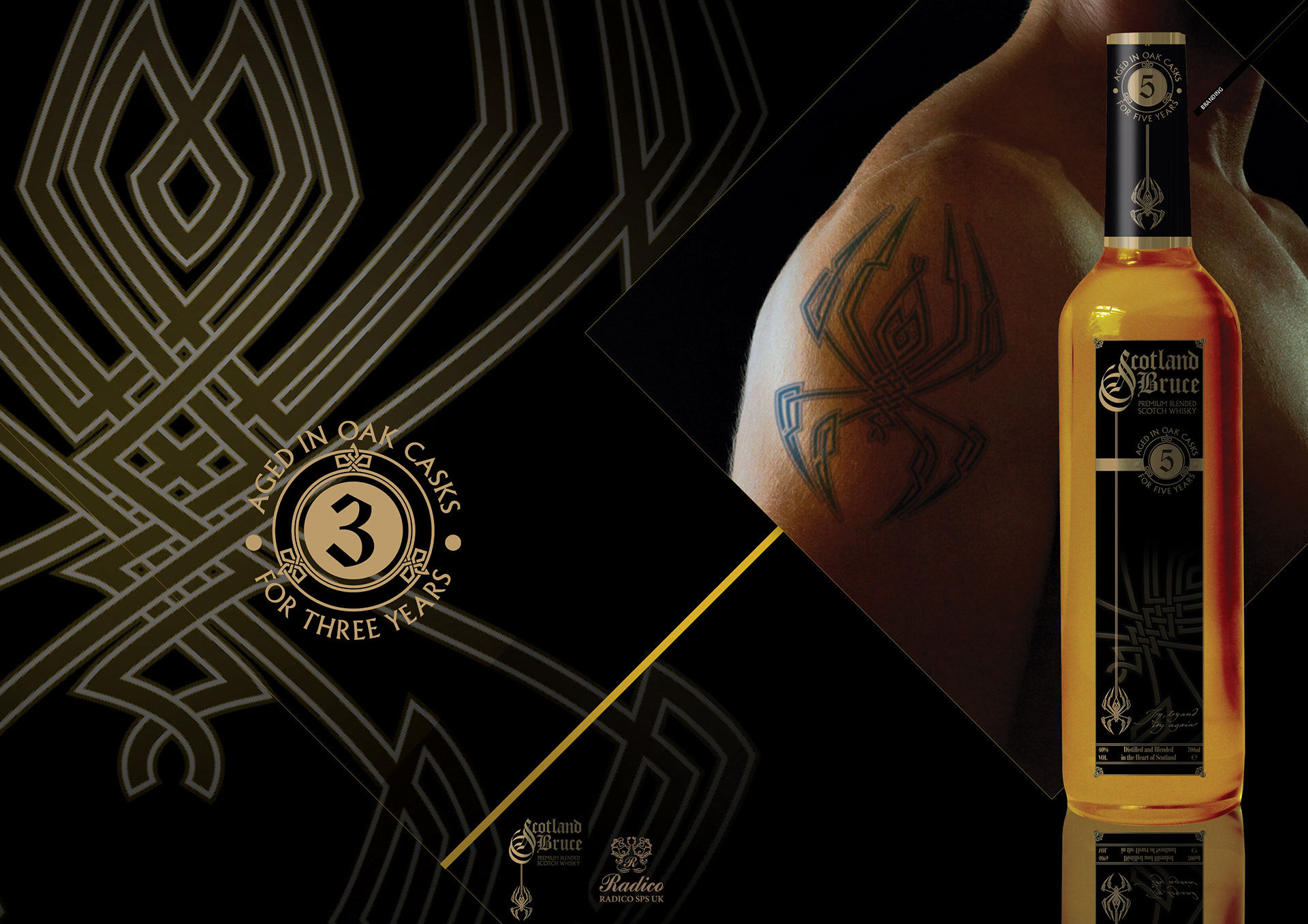
Scotland Bruce was the name chosen for a blended Scotch Whiskey bought by Indian distillers Radico Khaitan for distribution outside the UK.
Without losing it’s core values of tradition and taste, it needed a brand identity that was very Scottish, rugged and masculine, yet targeting a younger market than whiskies normally attract.
Multiple logos
Copywriting
Exhibition graphics
Labling
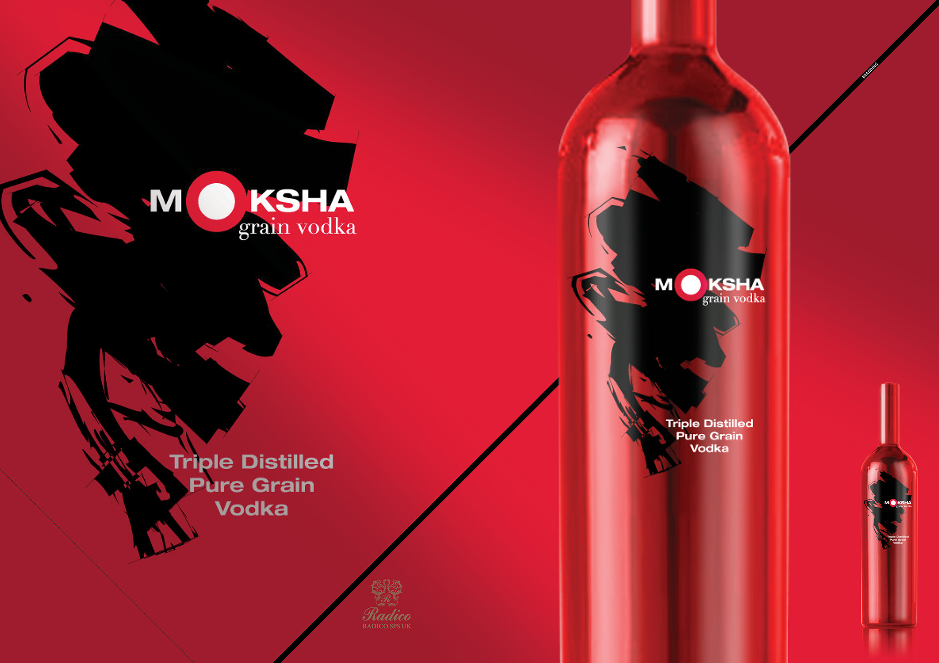
Moksha, a Sanskrit word signifiying the freedom of Nirvana, was the name chosen for an Indian triple distilled pure gran vodka by Indian distillers Radico Khaitan for distribution outside the UK, specifically emerging global markets.
With its red metallic bottle sleeve and logo comprising an enigmatic white out of red circle on black gestural brushwork, Moksha remains mindful of, yet unabashed by Vodka’s perceived Eastern European heritage.
Design
Concepts
Touch-up and image manipulation
Logos
Labling
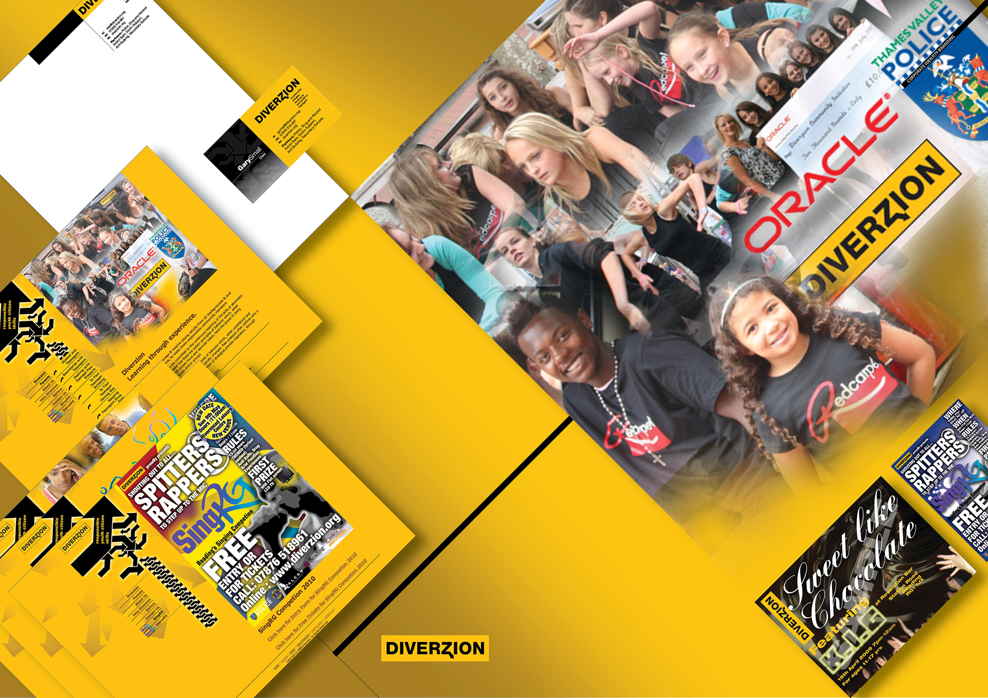
Pro-bono work for Diverzion. Originating in Afro-Caribbean West Reading, this initiative was launched to discuss and promote strategies to engender cross cultural inclusion in a programme to educate and discuss teenage boundaries, combat bullying and drug abuse/knife crime through self funding dance, music and other events
Logo and stationery
Website
Flyers and tickets
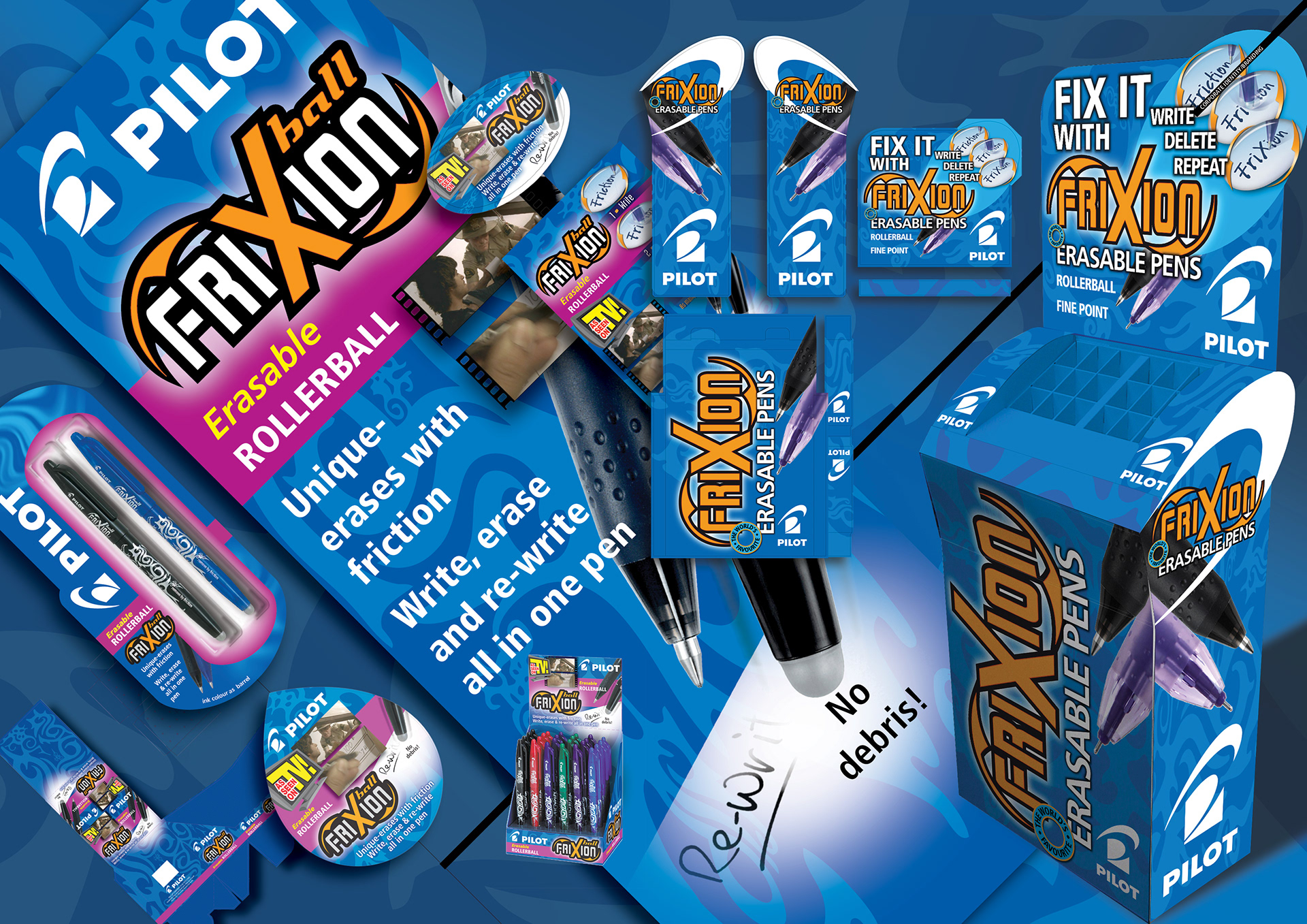
Branding
blister card
shelf wobbler
counter display unit
free standing display unit
pop-up banner
poster